DuKno App and Website
What DuKno Needed
DuKno approached AtWrk for assistance in developing their idea. My role as lead UI/UX Designer and Product Owner was to facilitate the product's development, design the application and website, serve as the point of contact with the owners of DuKno, and work with developers to test and ensure the quality met standards.
Customer Goals
Extracted from DuKno's mission statement, this is what the application aspires to achieve:
Feature List and Sprint Projection
I outlined the necessary features and allocated them across several sprints, considering development dependencies to establish an MVP.
During a two-day meeting with the owners of DuKno, we identified the initial features, which I later developed into the sprint contents mentioned above, along with the logo and the initial wireframe concept for the application.
The CRM will be developed using our modular form builder template, which we designed to be part of ServiceAtWrk’s backend offering.
Sprint 1 [Design]
Sprint 2 [MVP]
Sprint 3 [Social]
Sprint 4 [QOL]
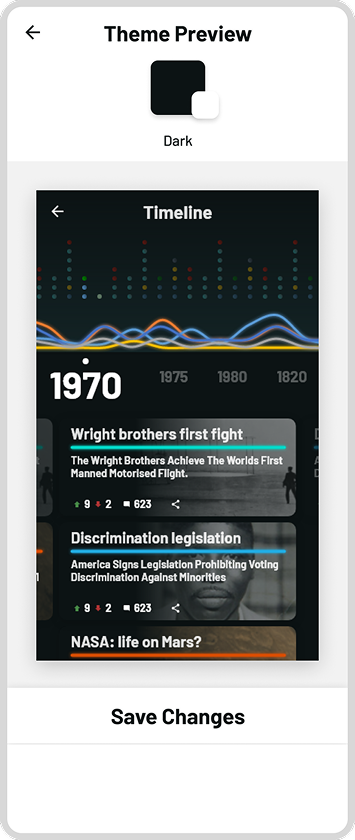
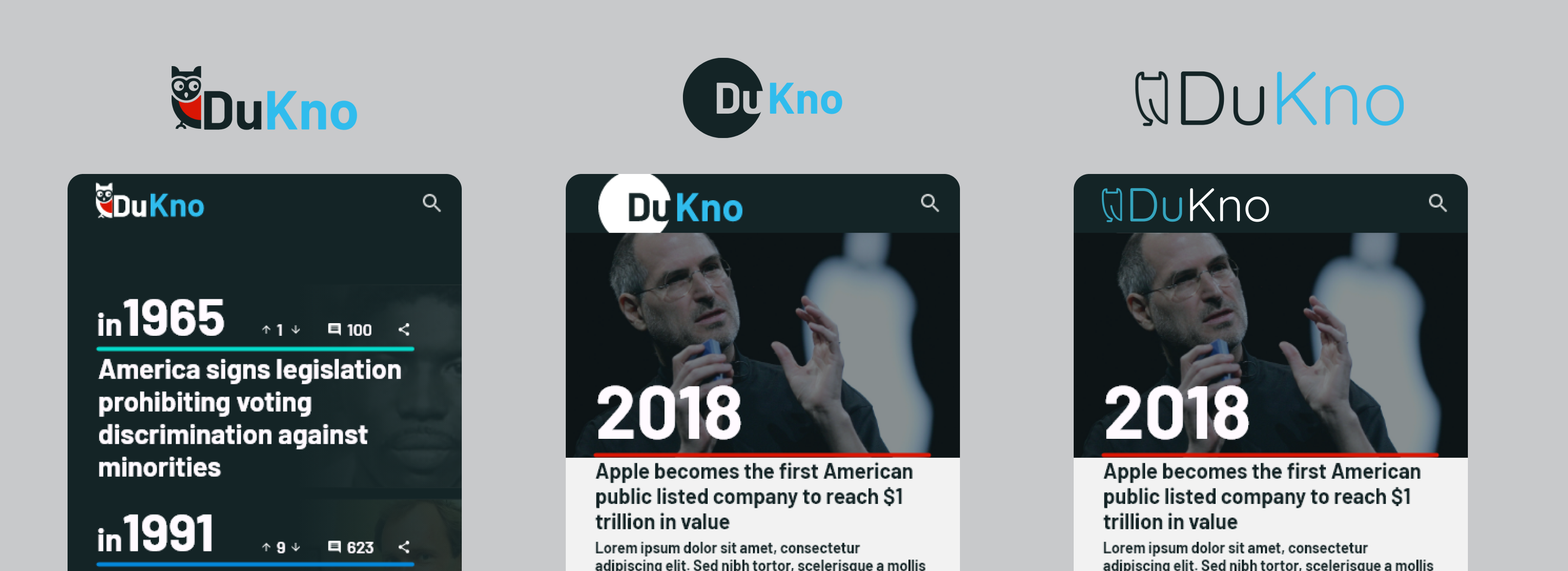
The customer approached us with the name 'DuKno' and their personal statement. Together, we decided they should differentiate themselves from a typical article reader. A darker, glowing theme with bright colors would impart a cool, tech-like vibe to the application and its glowing assets. I designed an owl mascot, a symbol of wisdom, learning, and insight, which aligns with their personal statement and mission. This choice reinforces the brand's curiosity and commitment to sharing facts and teaching in a social environment.
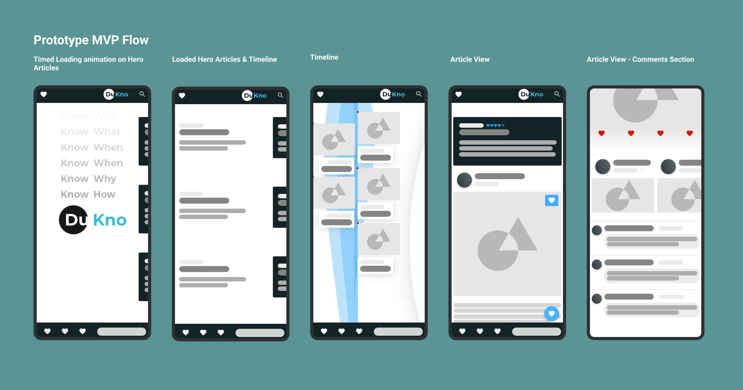
In the initial meeting, I reviewed the necessary features and outcomes from sprint 2 and compiled a shortlist of screens as prototypes.
During a two-day meeting with the owners of DuKno, we identified the initial features, which I later developed into the sprint contents mentioned above, as well as the logo and the initial wireframe concept for the application. The CRM would be created using our modular form builder template, designed to be part of ServiceAtWrk’s backend.
In the initial meeting, I reviewed the required features and outcomes from Sprint 2 and compiled a shortlist of screens to be developed as prototypes.
Must Have
Should Have
Could Have
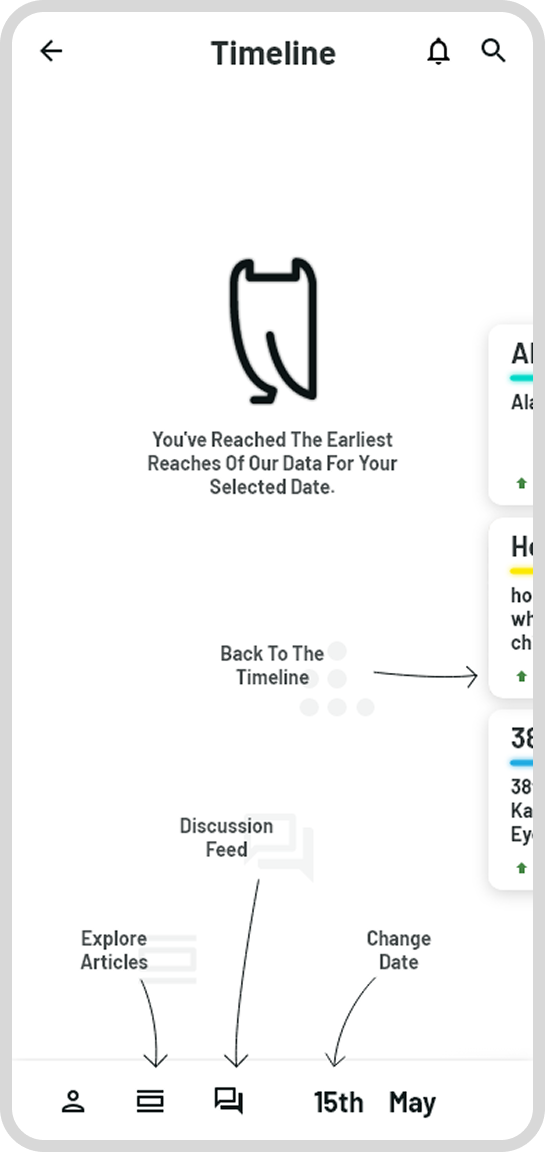
One of the most significant challenges of the project was the timeline and articles, which became the primary focus of the initial sprints. The original timeline concept had certain limitations. The accuracy of gestural scrolling through thousands of years was restricted when images or graphics were used to represent each event, and as the number of images increased, functionality needed improvement.
Failed concepts included a vertical timeline alongside articles. Having articles this large reduces the clarity of viewing multiple events on one date. Additionally, as Wikipedia covers entries from millions of years ago, this scrolling method is inaccurate and makes it difficult to gauge your position in the timeline.
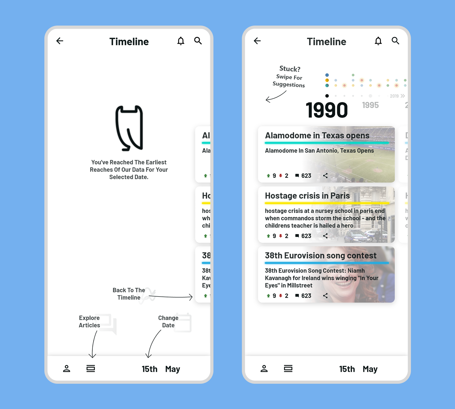
Displaying the number of events on the current day and nearby days also has its drawbacks. Without a comprehensive scroll wheel showing all nearby dates, only the next day is visible. Skipping days, months, or even years ahead becomes problematic, and this limited scroll wheel size restricts gestural control.
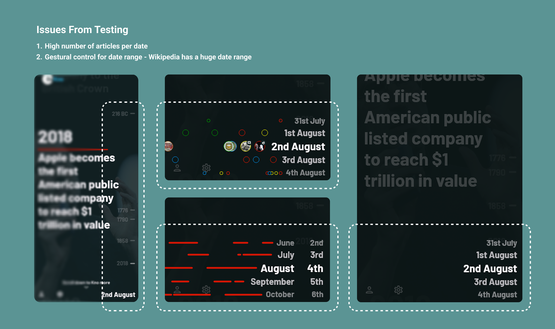
Given the vast number of articles required, and considering Wikipedia hosts thousands of entries, I needed to test a date range to estimate the average number of events the timeline might include.
I collaborated with a writer to create the articles and proposed using the 1975 - 2000 date range. I requested a variety of article types to populate a graph for design testing.
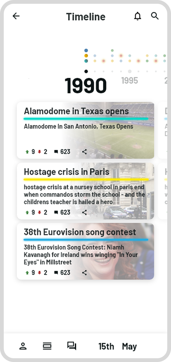
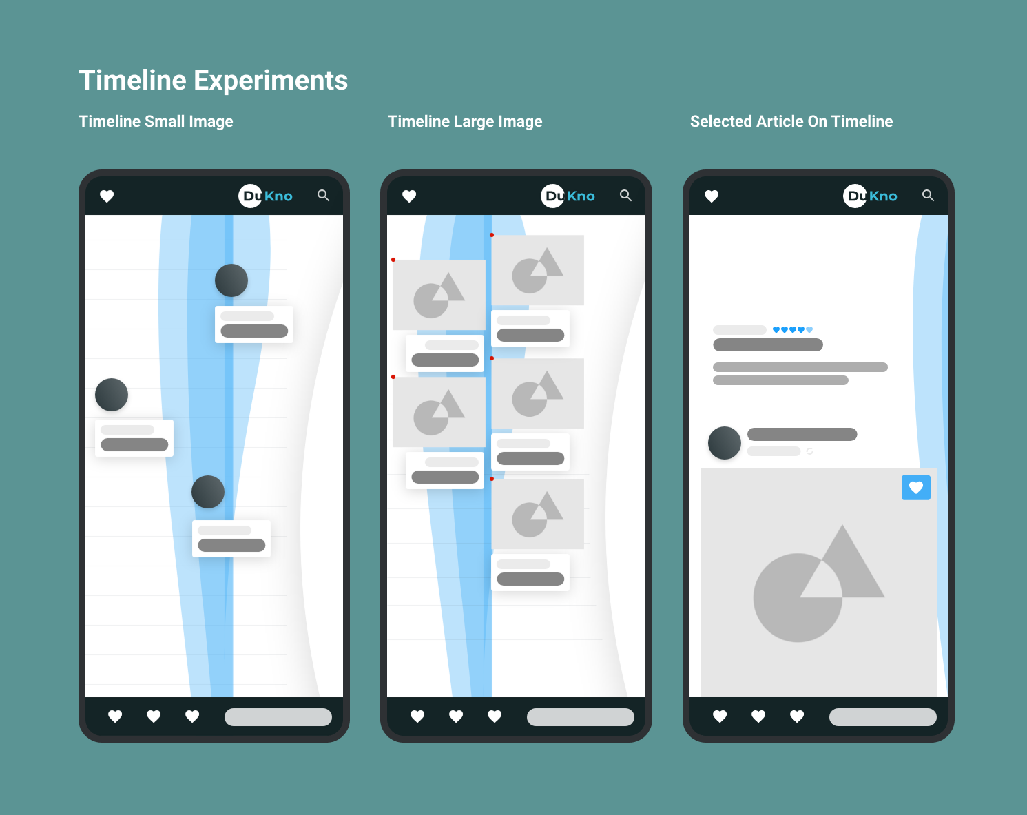
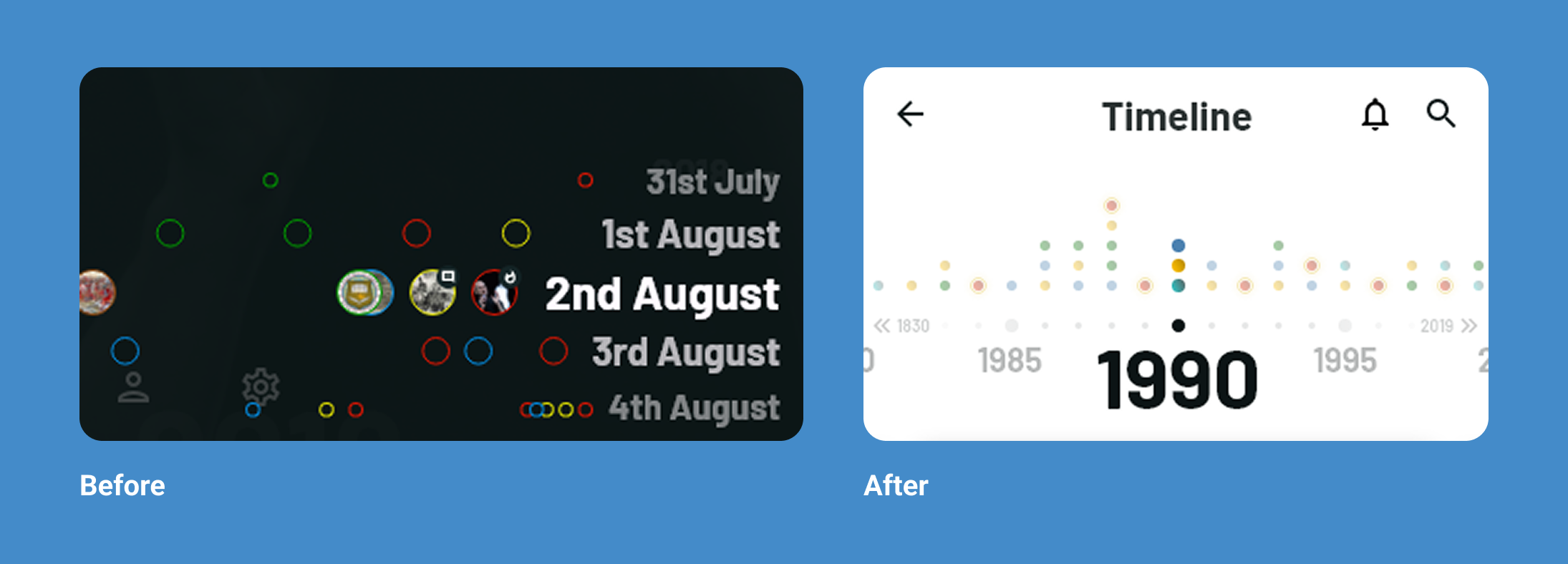
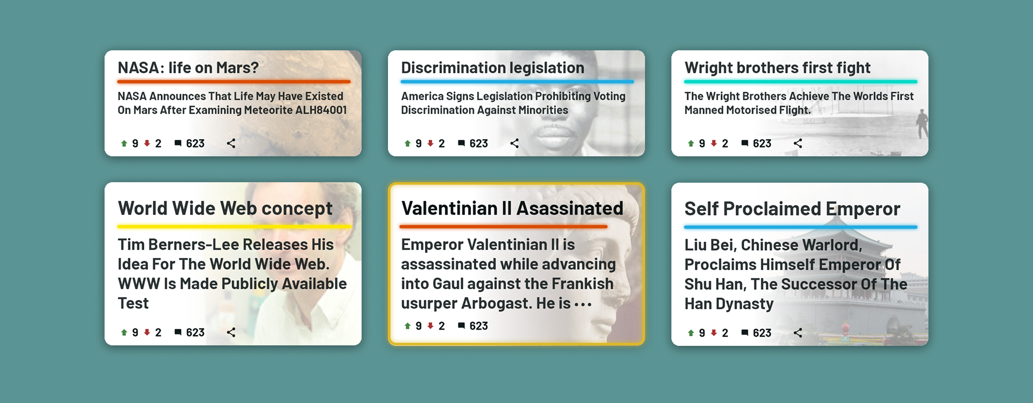
The 'bubbles' next to the date range at the bottom right of the timeline inspired a horizontal timeline with a fixed date interval of one year. Each colored dot above a date represents an event of a specific type.
The articles are handwritten, so populating the timeline will take time. I decided that this design supports varying amounts of content as well. If there is no article on a date, the date could be omitted from the timeline or left empty if necessary.
Articles are displayed as a list of shorter cards that can be tapped, rather than large cards that fill up the screen. Users can scroll vertically for more items on the date or horizontally to view more dates.
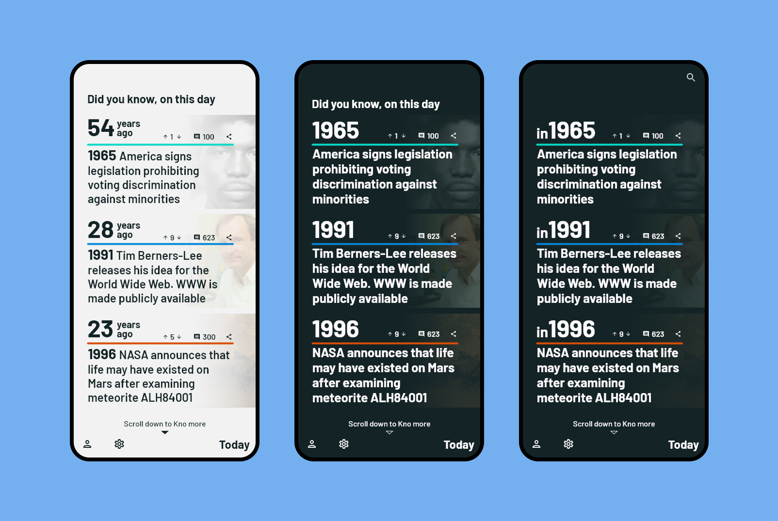
The development of the article list initially included a 'Did You Know, On This Day' header. However, this overlapped with the established 'On This Day' project, leading to its removal in favor of an alternative timeline in that space.
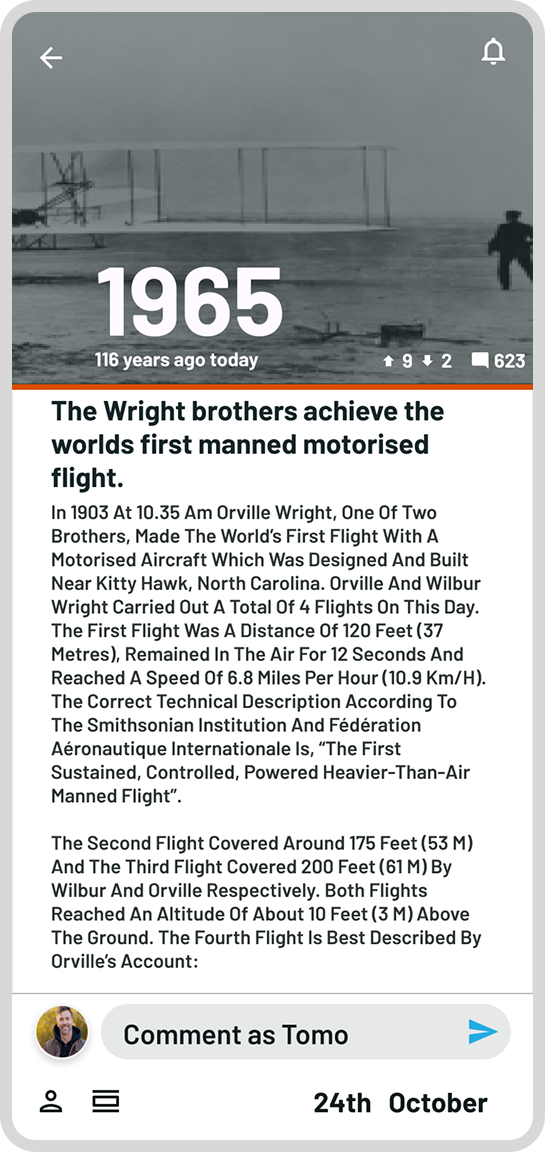
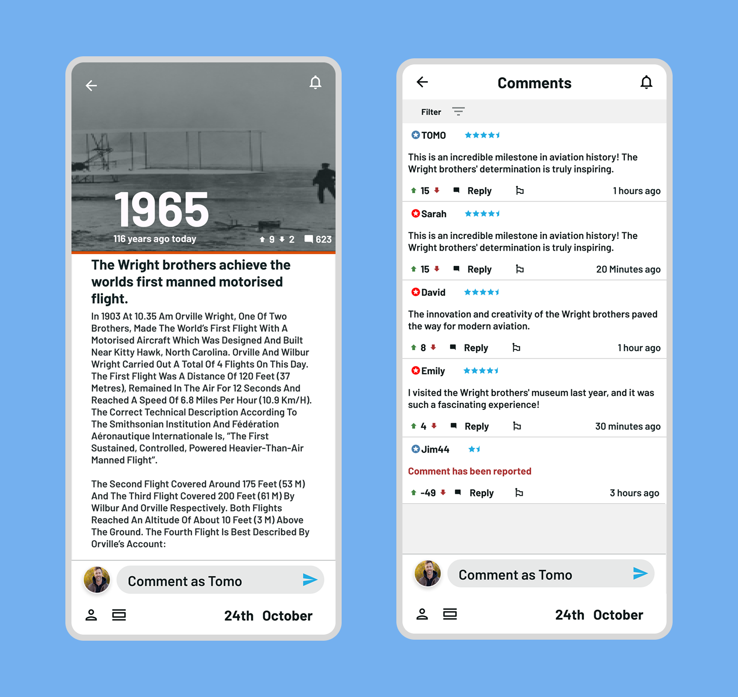
Tests were conducted to determine whether the title should reflect the number of years since the event occurred, the actual year of the event, or use an 'in' prefix with the year. This approach emphasized the date over the event but restricted the compatibility of the description and title. Consequently, I decided to display the date elsewhere on the screen in later designs, retaining only the title and description.
Articles are displayed as a list of shorter cards that can be tapped, rather than large cards that fill the screen. Users can scroll vertically for more items on the same date or horizontally to view more dates.
Below are examples of articles displayed on the timeline. Hero articles are shown as larger cards, while gold-banded cards appear from search or category filters. Bordered cards highlight similar articles the user has selected.
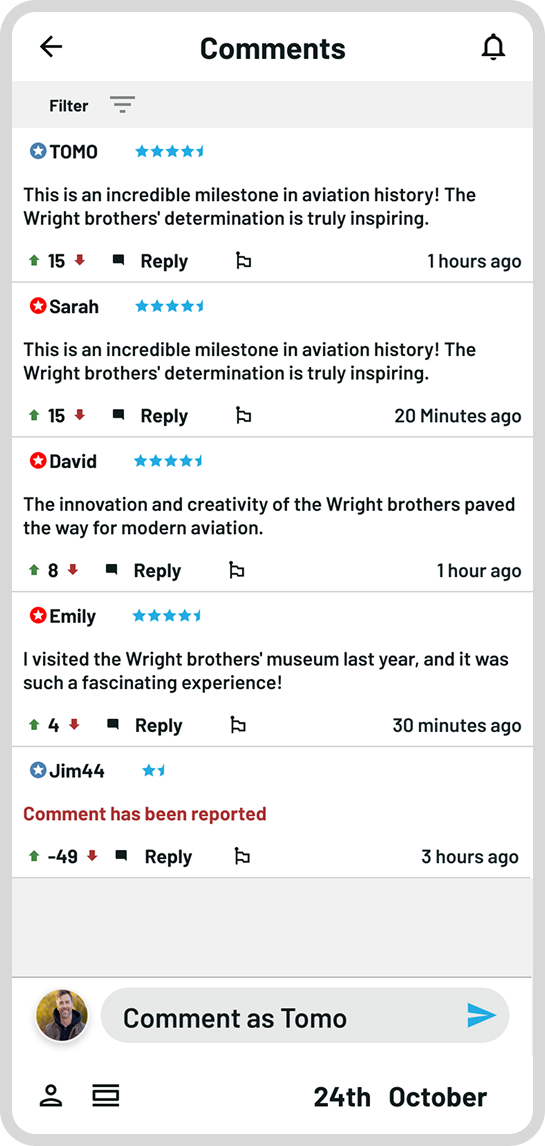
The development of article comments has evolved. Initially, designs showed comments attached to the base of the article below the references. This remains true in the final design. However, the comments are now presented in a single block, rather than as separate floating cards.
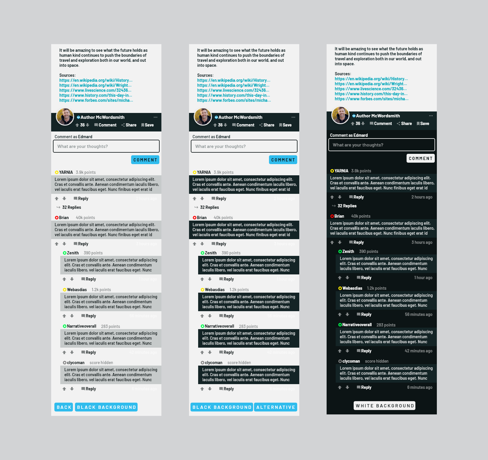
Below are the final screen layout for the article and comments. Final view of opened article and opened comments from within an article
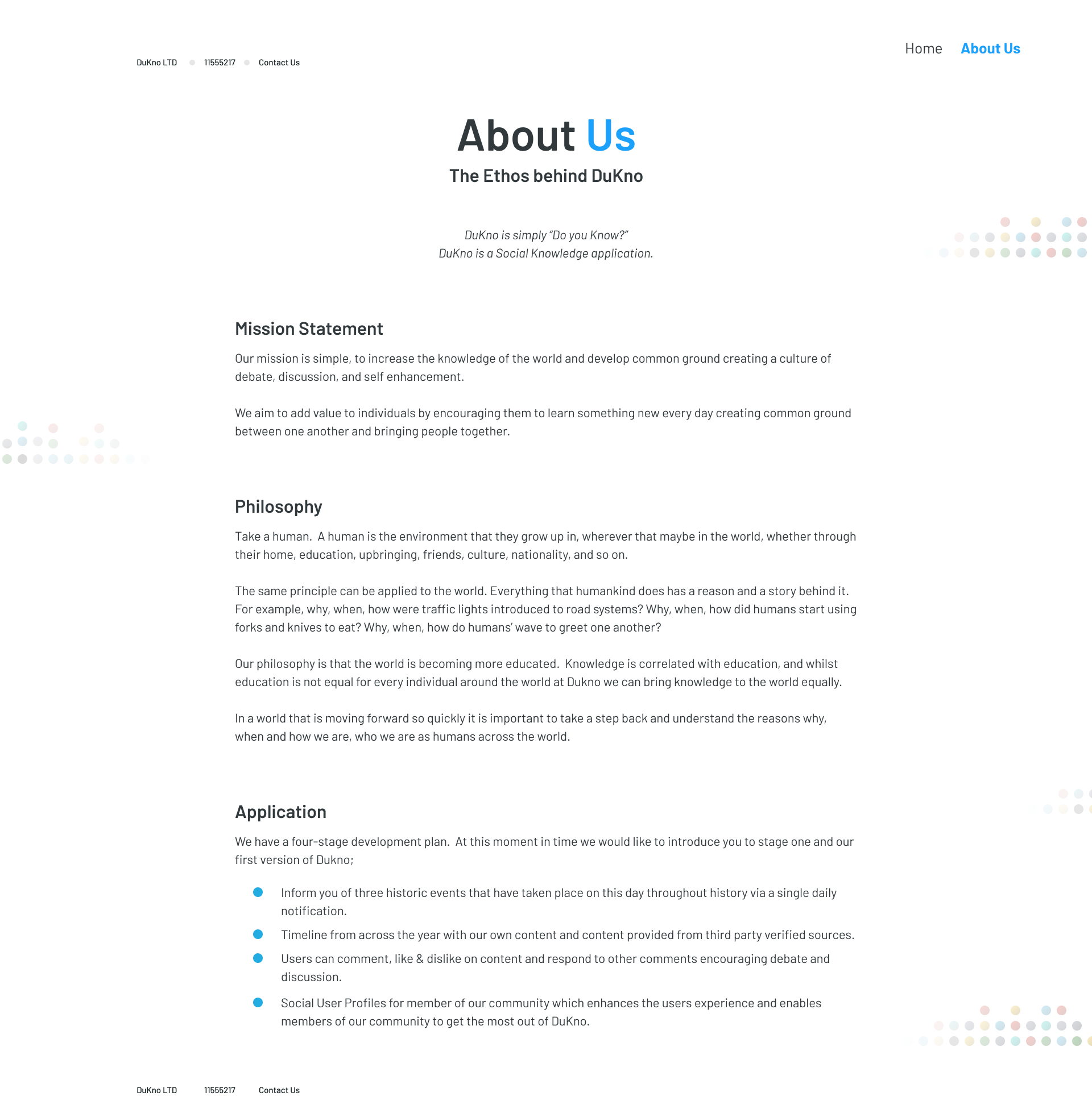
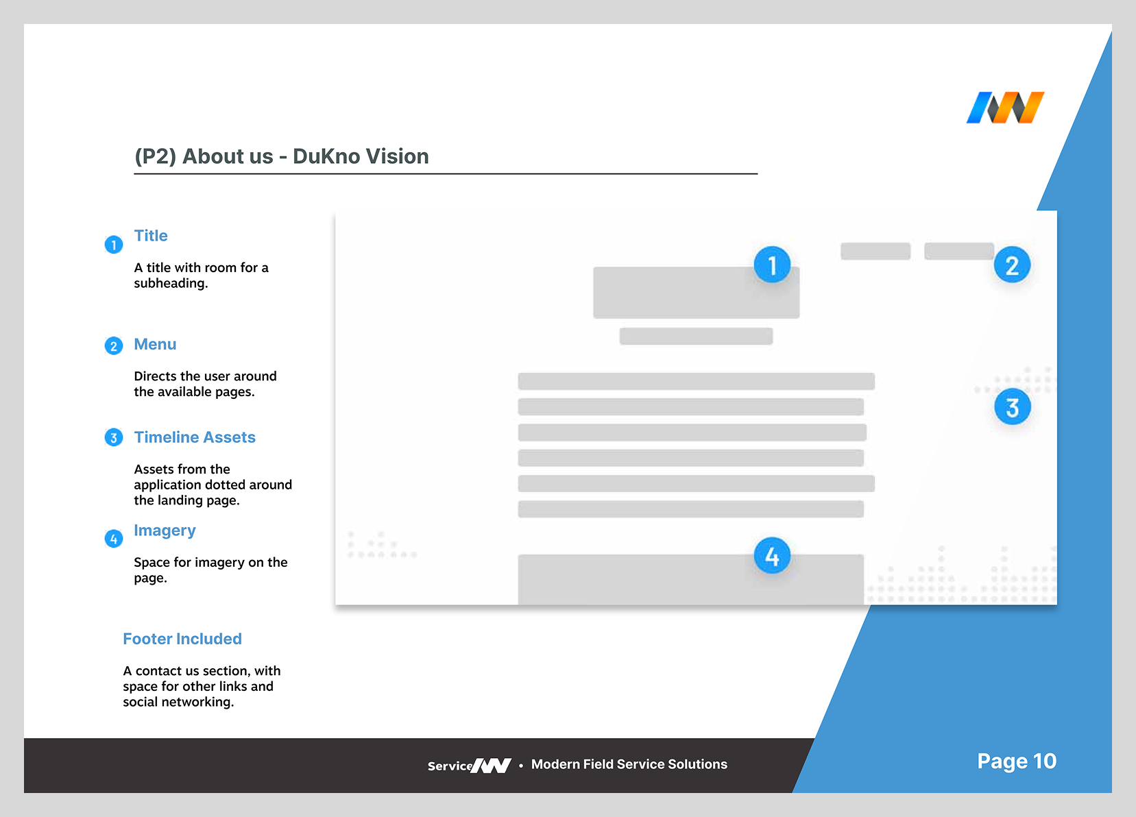
The minimal requirements for the landing page website included a landing page and an 'About Us' page that displayed the mission statement and vision of DuKno. There was consideration for a dedicated contact page, but it was deemed a non-essential feature. I was tasked with conceptualizing two versions of the website: one with minimal pages and another with expanded sections covering application features and a dedicated contact page. Ultimately, the owners chose the simpler wireframe with two pages: a landing page and an 'About Us' page with links to contact the owners.
Design Phases (Part 1)
Phase 1: Discovery
Phase 2: Market Research
Phase 3: Feedback
Phase 4: Wireframing (Part 1)
Design Phases (Part 2)
Phase 5: Wireframing (Part 2)
Phase 6: Final Designs
Phase 7: Revisions
Phase 8: Development
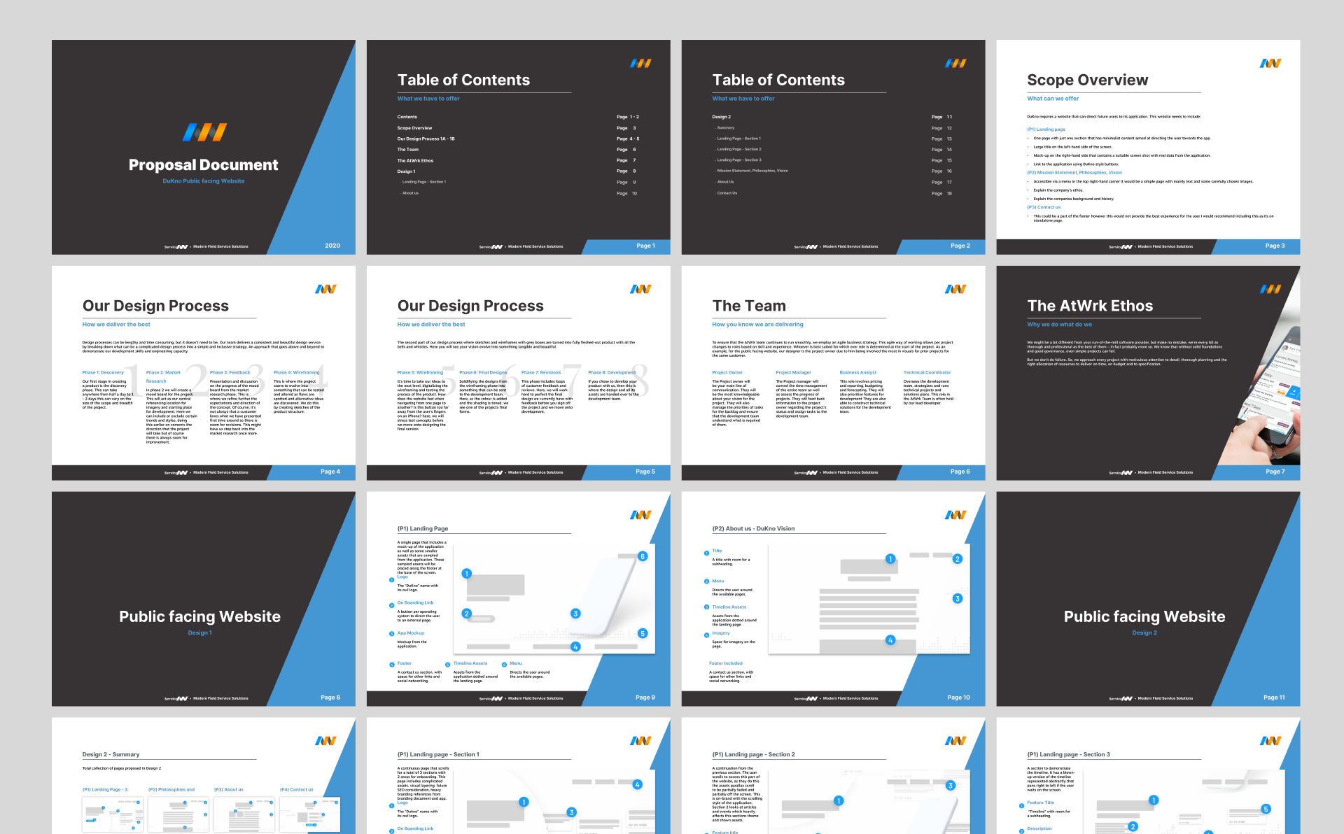
The proposal documentation is shown above. The website incurred an additional cost beyond the initial app development. I decided to pitch the website to ensure they had the necessary foundations to gain industry support.
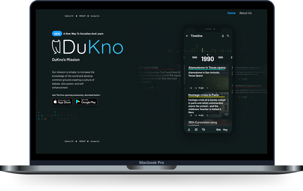
Design 1 chosen by client

The client chose a smaller version of the two designs for their website. A single landing page with a mock-up of the application and some graphics that displayed the function of the applications side to side scrolling through the articles and another page for the about us section.
Solution:
For the landing page, I opted for a minimal and sleek design that reflects the customer's ethos and the application's functionality. My goal was to create an impactful, modern, and crisp platform that they could expand upon in the future. Although the budget limited feature highlights, I conveyed the application's function through the mission statement and clear visuals.
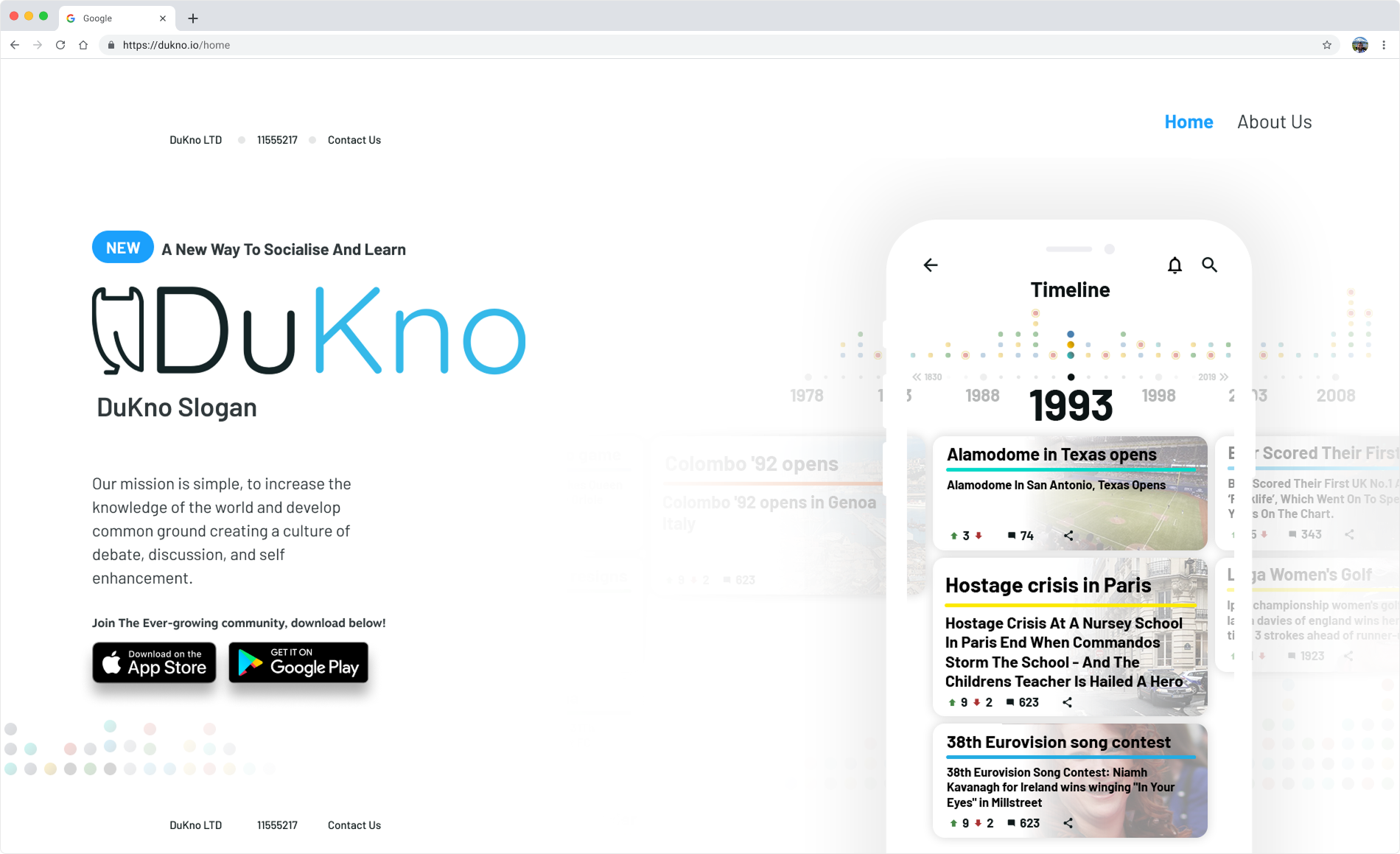
The client chose a smaller version of the two designs for their website. A single landing page with a mock-up of the application and some graphics that displayed the function of the applications side to side scrolling through the articles and another page for the about us section.
The About Us page demonstrated a clean and crisp attention to detail. I included a Contact Us button that opens the user's default email system, the company registration number, and small images that remind users of the article-based function and dot style found in the application.