As a Contract Senior UI/UX Designer, I led the design of Emerald Nursing - an all-in-one platform for managing, hiring, and distributing nursing staff, streamlining payments, invoicing, acquisition, and scheduling within a single service.
ShippedEmerald Nursing supplies nurses to the Irish healthcare industry, utilizing the 'Emerald Application,' a SaaS solution created by '20x' to optimize recruitment and administration. This system encompasses a mobile app, a client website, and a CRM, all derived from a licensed base product by 20x.
Emerald anticipated minimal onboarding adjustments from the service purchased from 20x. However, they encountered significant usability issues: a bug-ridden mobile app, inefficient development practices, ineffective project management, a convoluted screening process, and inadequate mobile CRM translation as web wraps.
Project Overview
Emerald Nursing is a company who specialises in hiring out nurses to health sector in Ireland. They recently hired a team to create a SaaS product coined "Emerald Application" which is part of a system designed to streamline the hiring, onboarding, management and workload for nurses in healthcare. The system includes a mobile application supported on iOS and Android, a customer facing website and a CRM for the workers of Emerald.
The application is forked off of a base product created by 20x development studios that Emerald have paid for a license to use and have free reign to request and pay for features on their forked product.
My Role
As a contract Senior UI/UX designer, I audited and redesigned the system, concentrating on onboarding and screening to streamline processes and unify the UI and facilitated communication while overseeing the development team.
Emerald purchased a licence for a workforce management platform built by 20x, expecting a ready-to-use solution that required only minor adaptations during onboarding. However, once implemented, Emerald discovered significant usability and consistency issues across the platform. The mobile app was buggy and unstable, the screening process — a critical first step for new users — was overly complex, and the web-wrapped CRM content did not translate well to mobile layouts.
This case study focuses on the work I did for the onboarding and screening experience. My goal was to simplify the end-to-end process, unify the UI between web and app, and provide users with a clearer path to complete registration and compliance requirements.
Problem statment
The screening process was the largest source of drop-offs in Emerald's user onboarding. Several challenges were identified during the audit:
Confusing registration experience
Users had to manage multiple forms and unclear instructions, leading to frequent abandonment.
Inconsistent workflows
Different versions of screening forms existed between web and mobile, causing user confusion and repeated data entry.
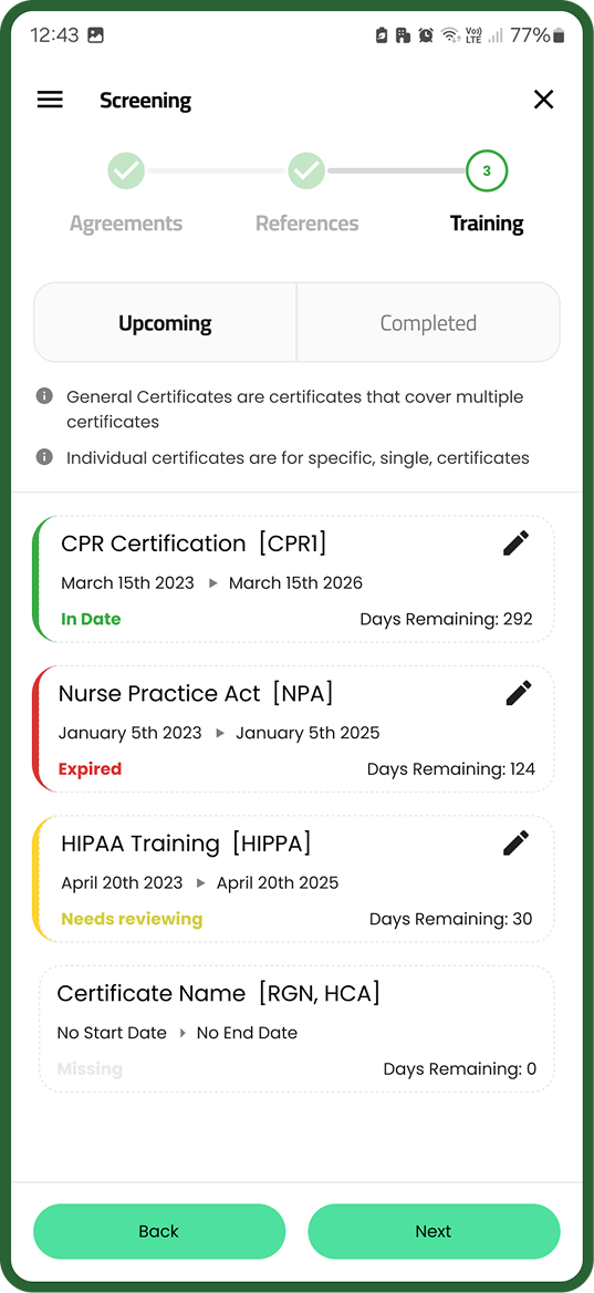
Training module issues
Users struggled to complete required training modules, and admins lacked reliable tracking of completions.
Reference submission failures
Missing or stalled references caused unnecessary delays in the screening process.
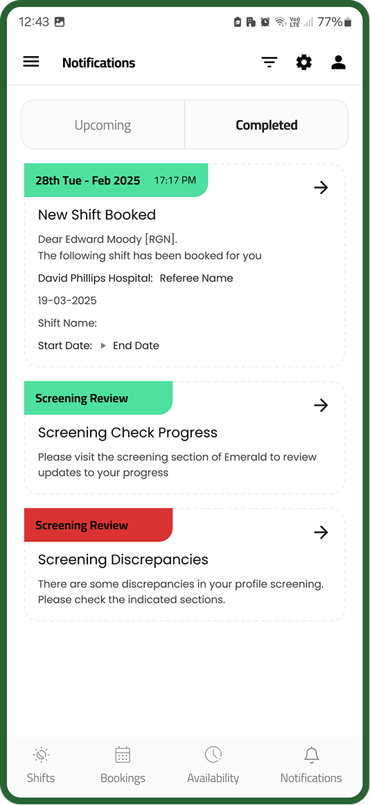
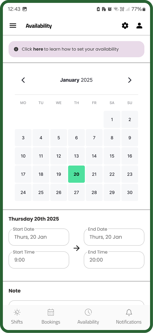
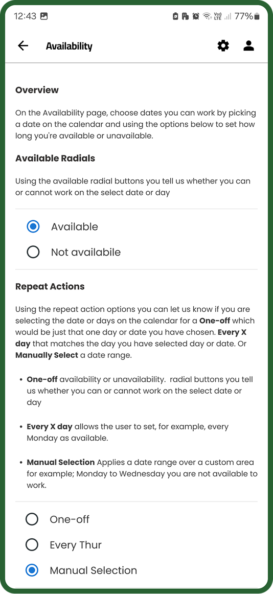
Poor visibility on progress
No central dashboard or tracker meant users couldn't see where they were in the process or what was left to complete.
scope
- Improving visual clarity & hierarchy - enhancing legibility, spacing, and information priority.
- Ensuring UI consistency - aligning the app’s design language with the CRM and recommending a move toward a fully native mobile experience.
- Enhancing progress tracking - redesigning the progress bar and introducing clearer step indicators.
- Simplifying workflows - removing redundant steps, reorganising forms, and grouping related tasks.
- Adding guidance - creating a welcome overview and a completion dashboard to help users understand and revisit their progress.
What The Project Started With
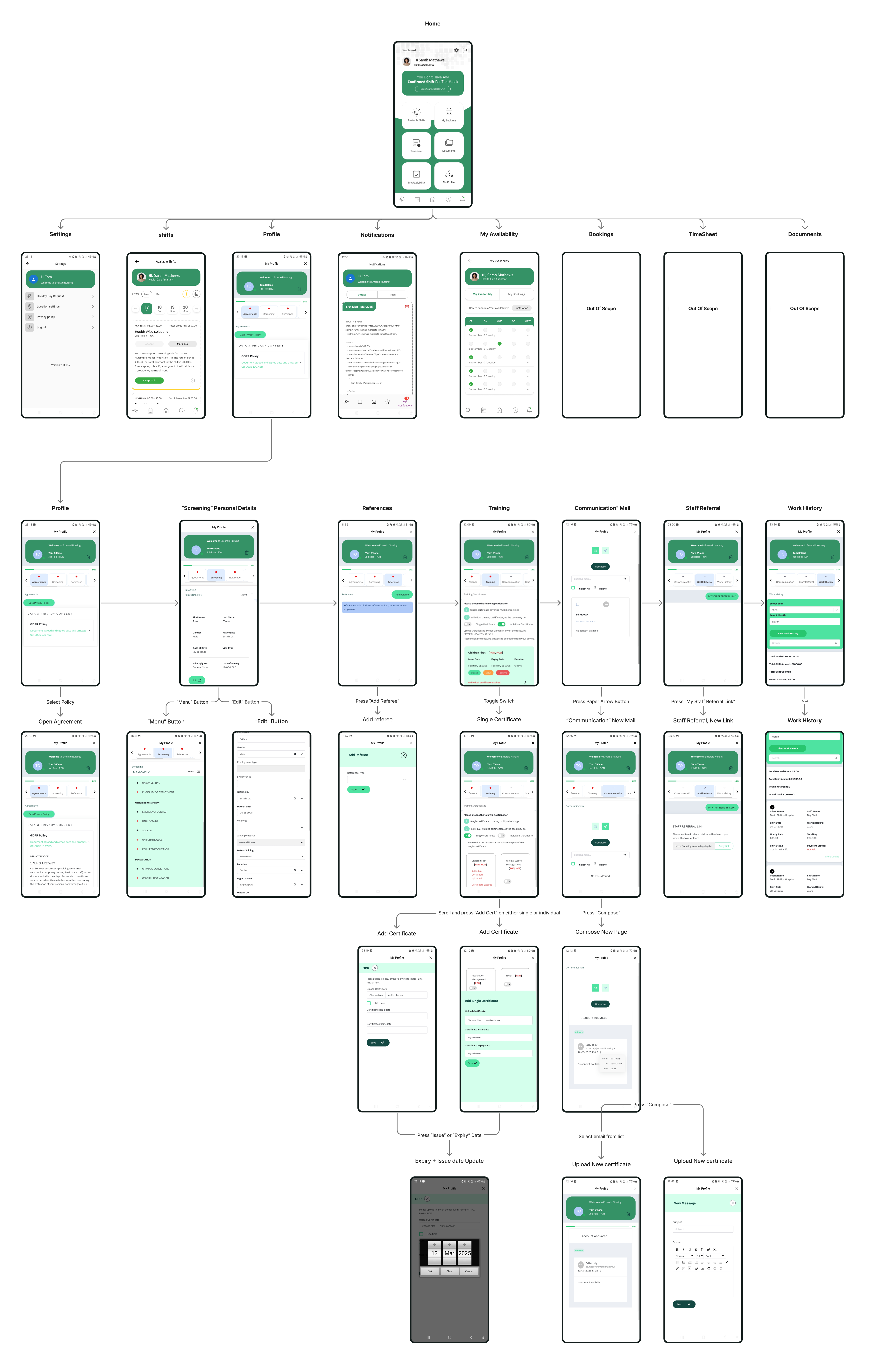
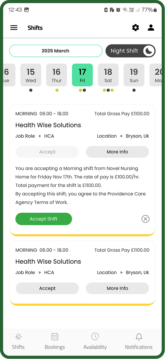
We started with a lengthy screening process that included several flows; Agreements, “Screening” for personal details, References, Training, Communications, staff referral, Work history. Additionally, there was an absence of a mobile registration process, and multiple instances of duplicate data entry were present across web registration, pre-registration screening, and profile setup.
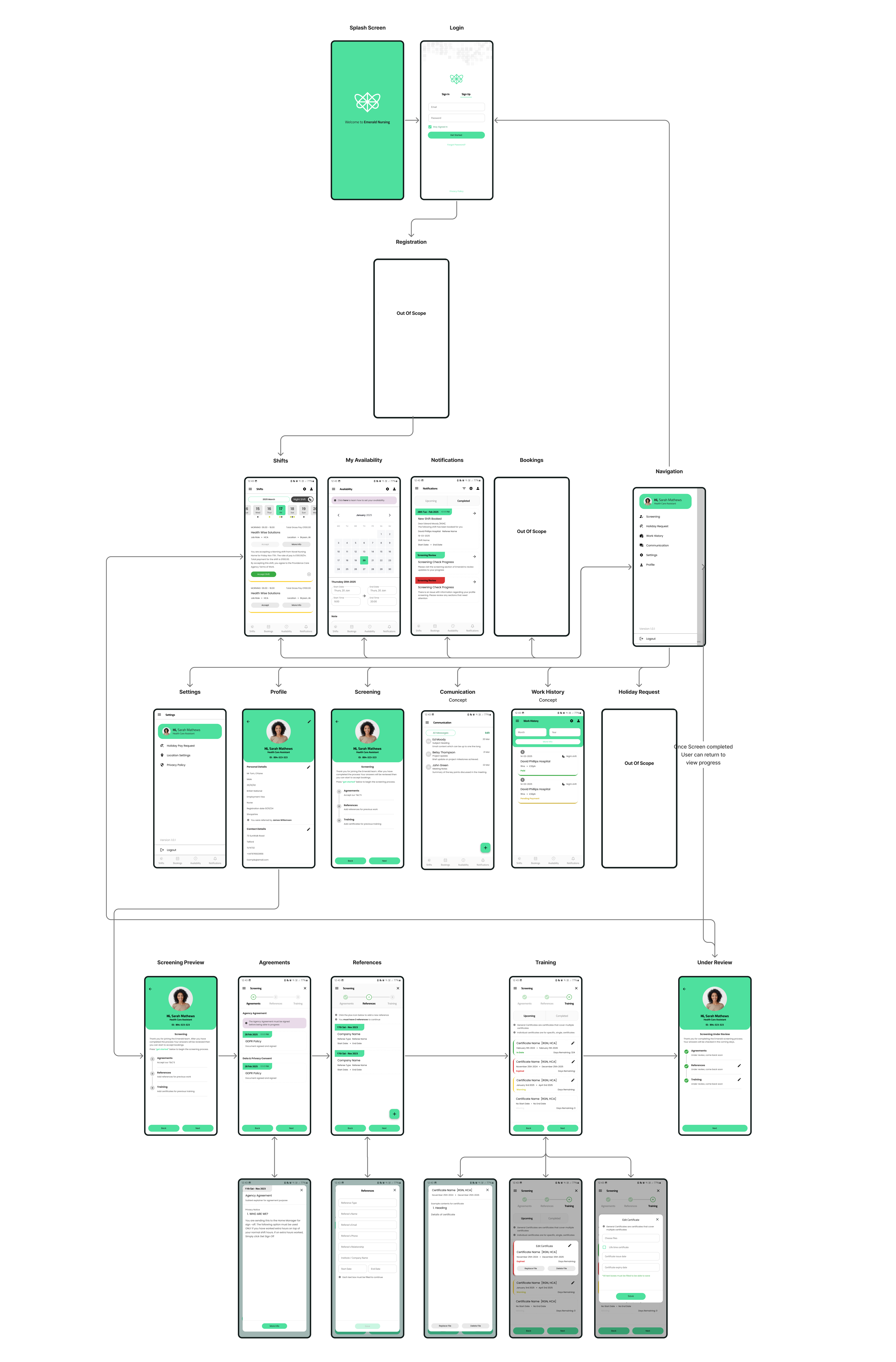
System Map + Web Registration
Overview of Web Registration
The outdated design and multiple steps across different pages undermine confidence in the registration process. Additionally, duplicate data requirements during registration and onboarding unnecessarily extend the process.
Key Issues Identified:
- Web-only registration: The current process is limited to the web, yet the nurse demographic for Emerald shows that first-time users are more likely to register via phone.
- Manual pre-qualification: Pre-qualification questions are checked manually and operate as a separate process from registration.
- Data duplication: The in-app screening process duplicates both registration and pre-qualification steps.
- Complex workflow: The combined registration, pre-qualification, and screening process involves excessive barriers and tab switching, creating a convoluted user experience.
- Excessive manual work: Compliance managers must manually review data that could be automatically validated, increasing unnecessary workload.
Visual representation of the registration process. Seen in stages 3 and 4 of the system map.
Solution Implementation
Approach + Key paths to improvement
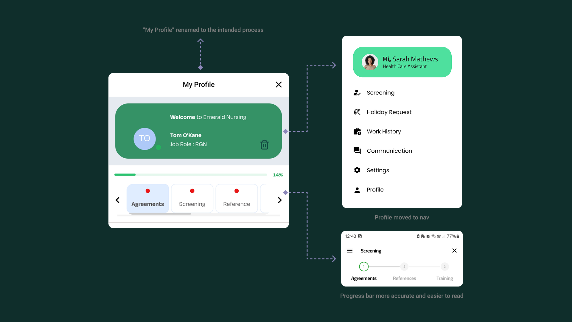
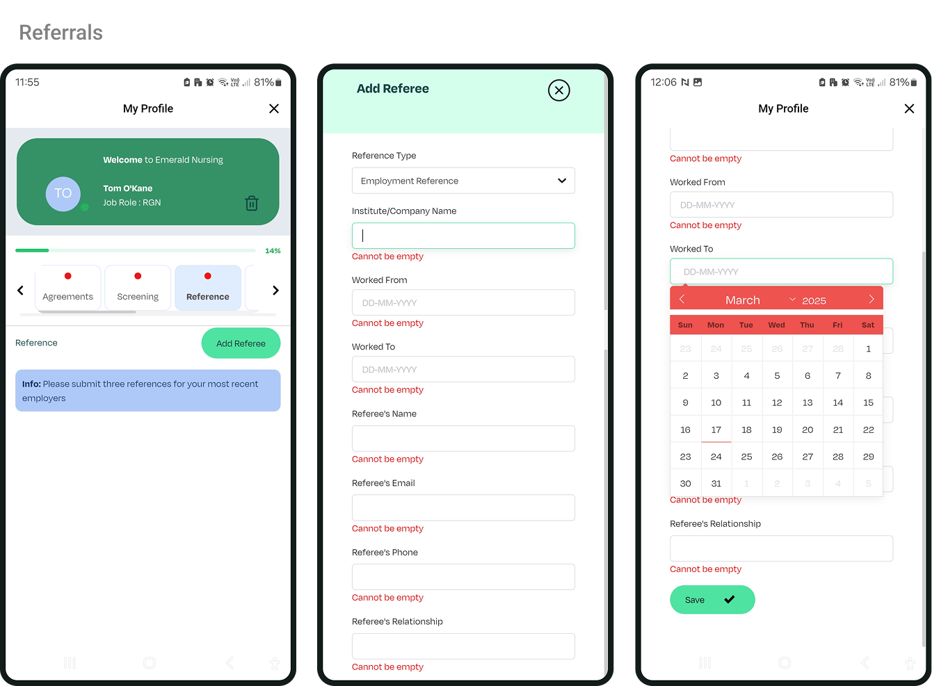
The screening process was cluttered, repetitive, and poorly placed within the Profile section. Users didn’t need to see their own profile during screening, and the banner wasted valuable space.
Key improvements:
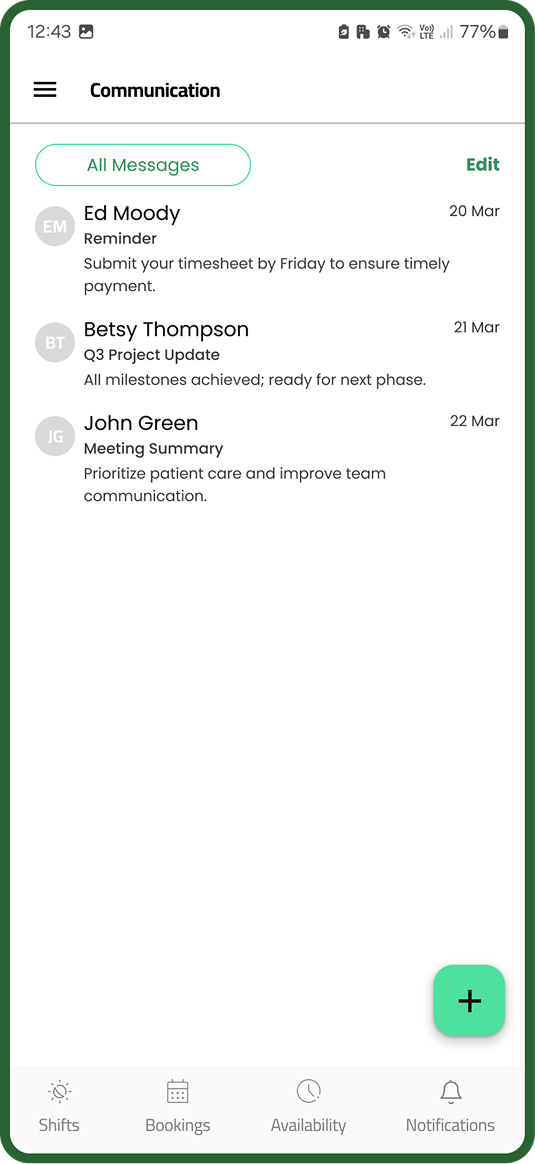
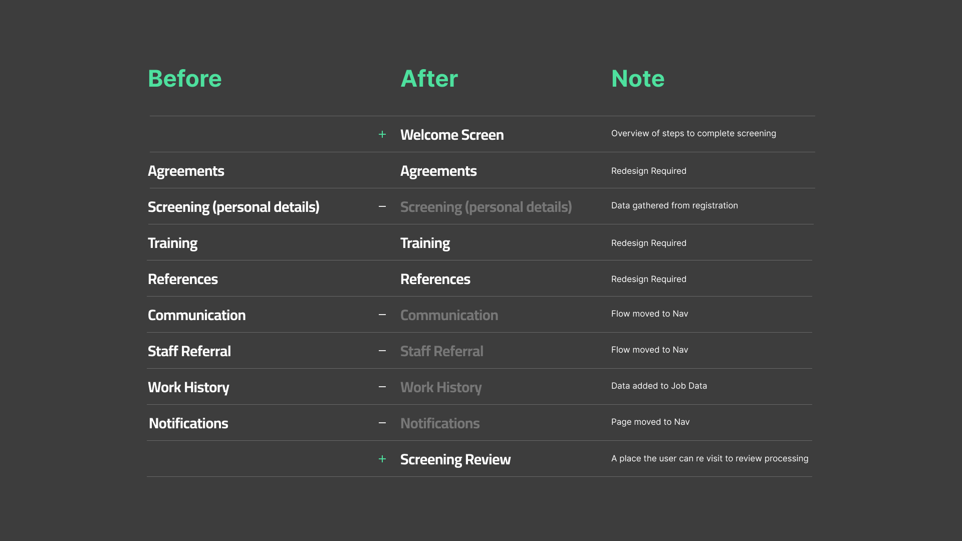
- Removed redundant flows (Communication, Staff Referral, Work History, Notifications)
- Moved screening away from Profile into a dedicated flow
- Replaced stage buttons with a clear progress bar
- Unified the design language with the rest of the app
- Introduced progress tracking for users
- Reduced manual compliance checks through automation
- Defined clearer data points across web and mobile registration
- Designed a lightweight, upload-free compliance document system
De-Cluttering the Profile
Moving away from 'Profile' as location for screening process

Discontinued using floating cards for forms as they proved ineffective for endless scrolling
Tabbed view recieved UI update and terminilogy improvments
Uniform expirience across IOS and Android. Updated text boxes and text spacing to M3 standards with accessibility considered
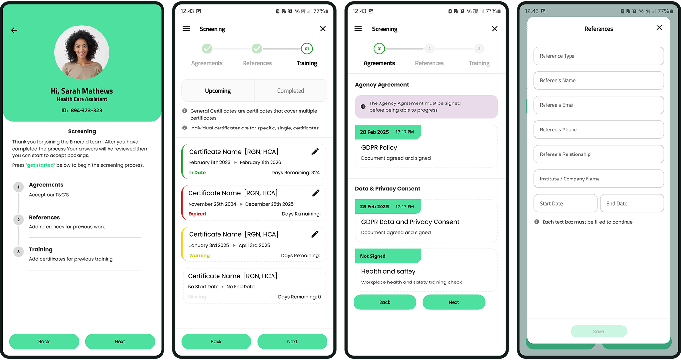
The policy cards have been standardized to match the application's card style, and the agreements for the screening process are now placed in a scrollable dialog box.
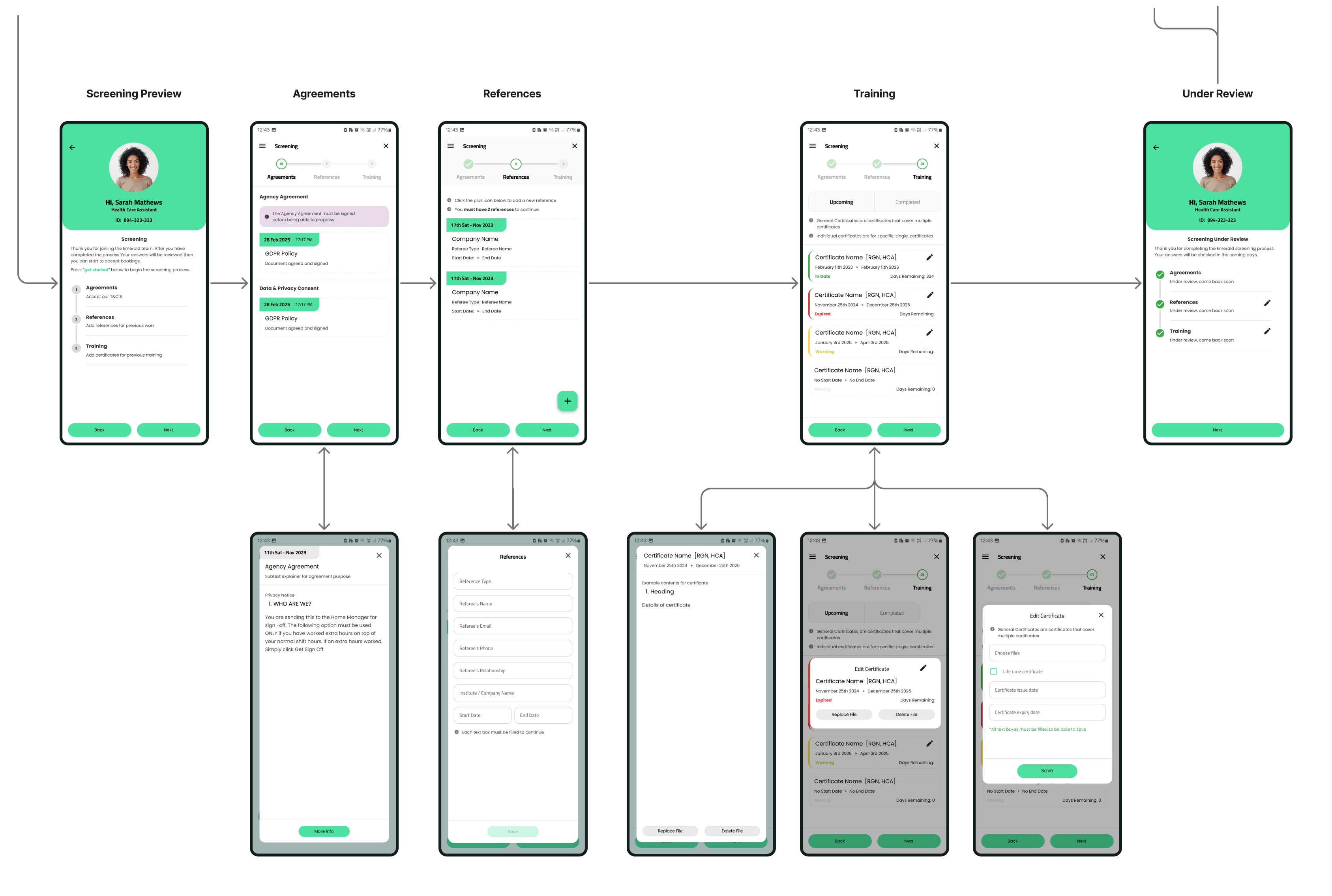
App flow comparison
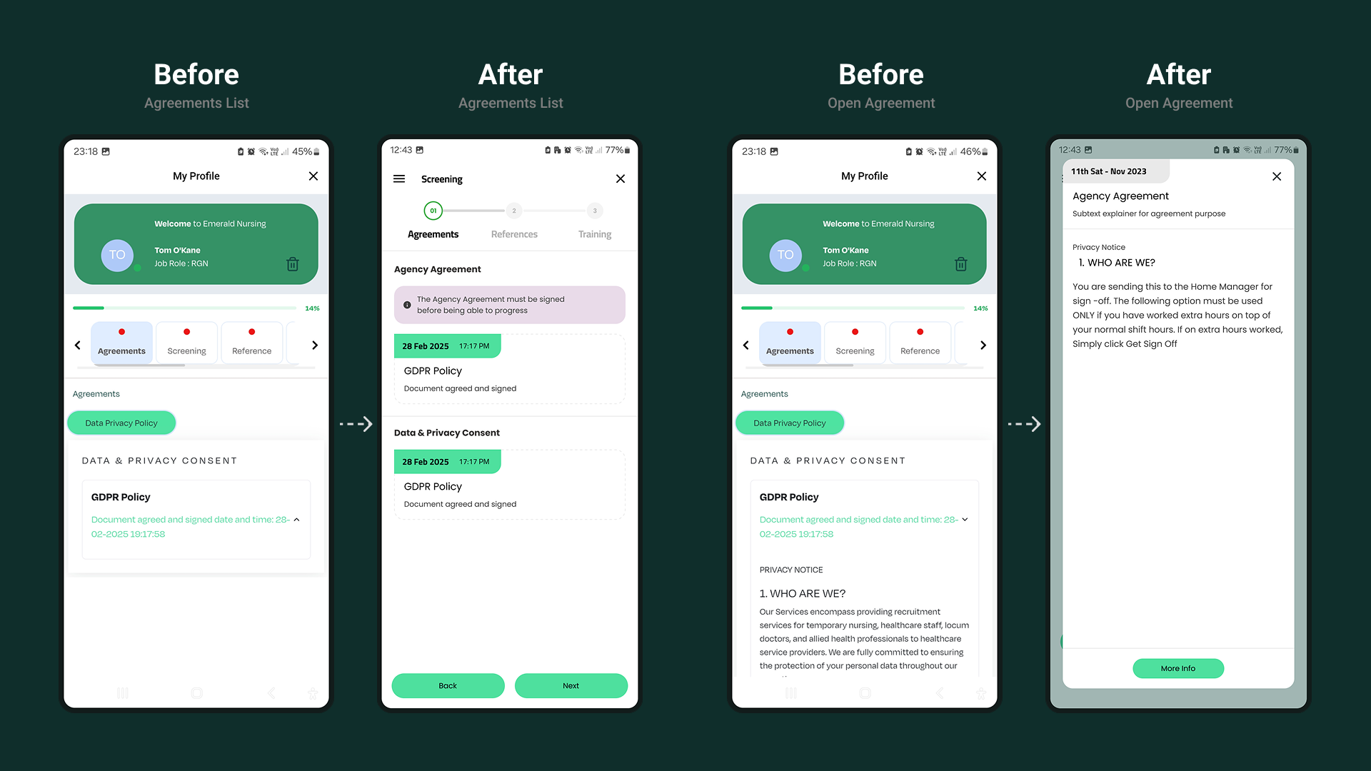
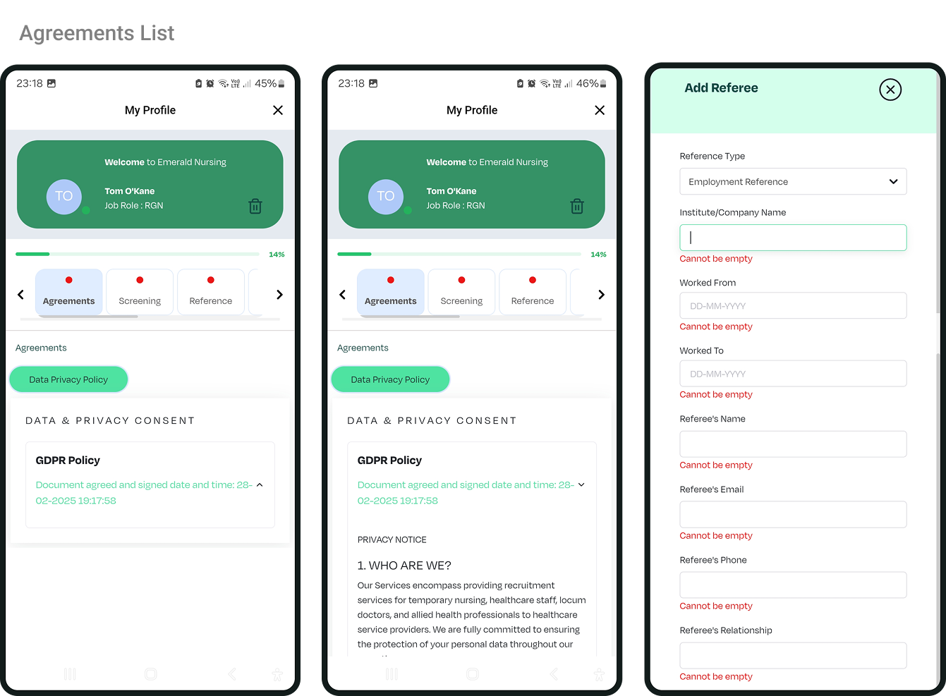
Agreement List and Open Agreements
New System Map
Before (left, Dark Green) and After (right, Light Green)
Discontinued using floating cards for forms as they proved ineffective for endless scrolling
Tabbed view recieved UI update and terminilogy improvments
Uniform expirience across IOS and Android. Updated text boxes and text spacing to M3 standards with accessibility considered
This app flow focuses on the screening process which starts at the end of the registration on the system map (which takes place on web)
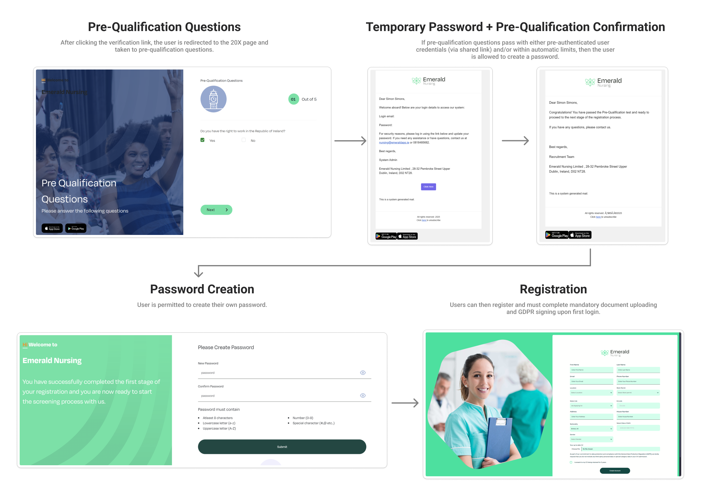
New Registration Process
Combining screening process, pre-qualification question and profile requirements
The web registration, screening process, pre-application forms, and pre-qualification questionnaire currently duplicate information and involve too many steps.
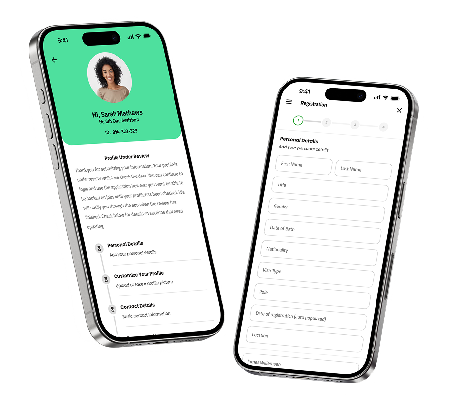
I prioritised a mobile-first approach to develop a streamlined registration process, integrating these requirements into a single flow. My focus will be on creating a mobile version that consolidates all necessary data, which developers can later adapt for the web version.
Discontinued using floating cards for forms as they proved ineffective for endless scrolling
Tabbed view recieved UI update and terminilogy improvments
Uniform expirience across IOS and Android. Updated text boxes and text spacing to M3 standards with accessibility considered
Where we started
We started with a lengthy screening process that included several flows; Agreements, “Screening” for personal details, References, Training, Communications, staff referral, Work history. Additionally, there was an absence of a mobile registration process, and multiple instances of duplicate data entry were present across web registration, pre-registration screening, and profile setup.
The registration process required multiple components, some of which were redundant:
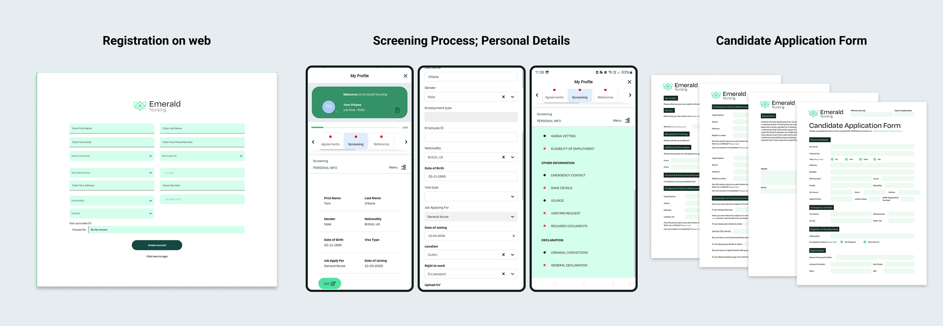
- Candidate application form: Emailed to potential users; mandatory but could be completed after initial web registration.
- Web registration: A web-only process to create the account.
- In-app screening: Collected personal details that had already been provided during web registration and the candidate form, introducing duplication.
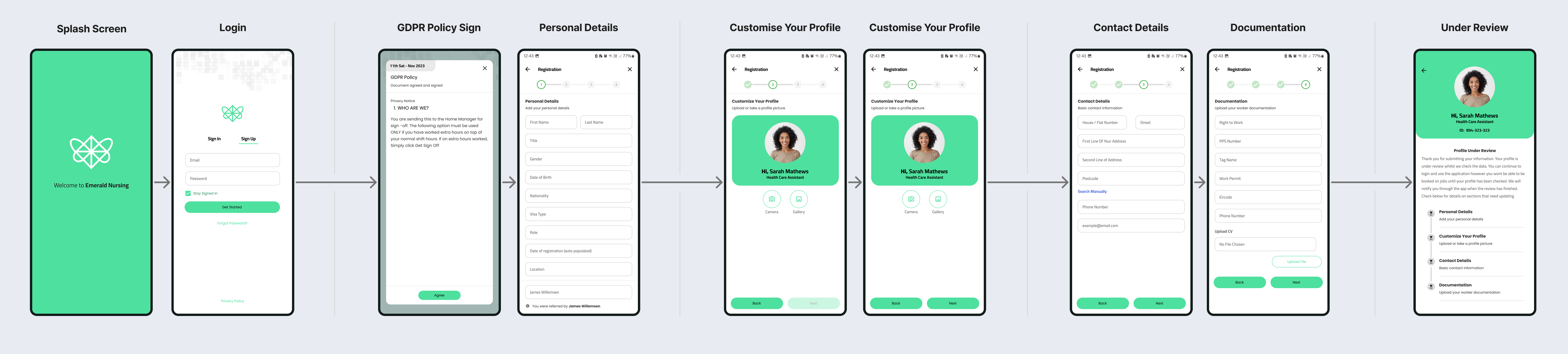
Final Flow
By gathering data from the web registration, the previous screening process, and the candidate application form, I developed a new registration process. The aim was to enable in-app feedback for the manual review process and incorporate information from both the candidate application form and web registration into a single process that could later be adapted for the web.
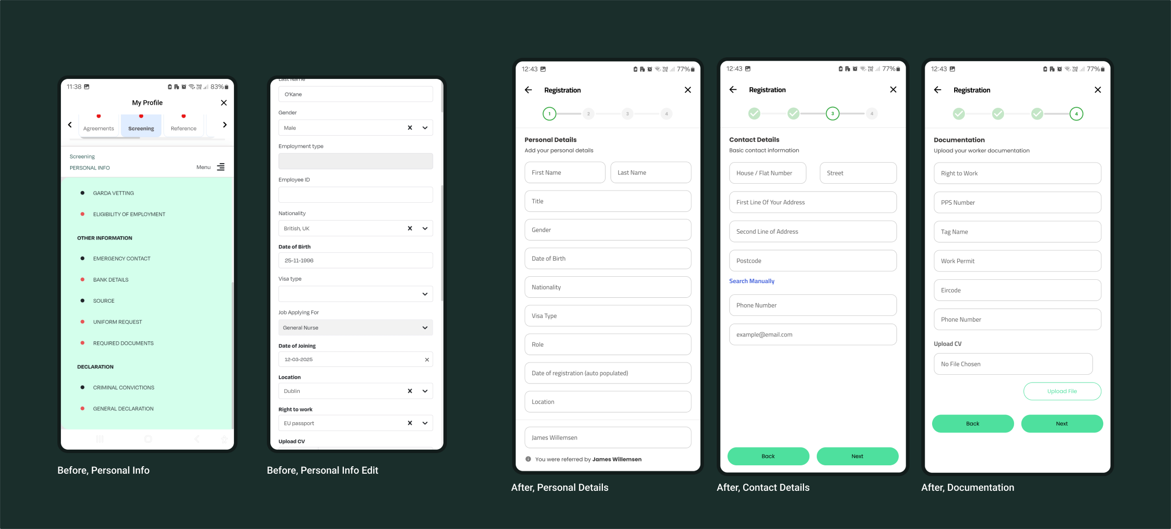
A direct comparison of the personal details section before and after the modifications
New Screening Flow summary
By separating the flows that were originally part of the screening process into their own section, the process is now more streamlined and manageable. Additionally, I have included a method to return to the screening process through the navigation menu to track the application's progress.
The above illustrates the complete end-to-end screening process within the app.
.png)