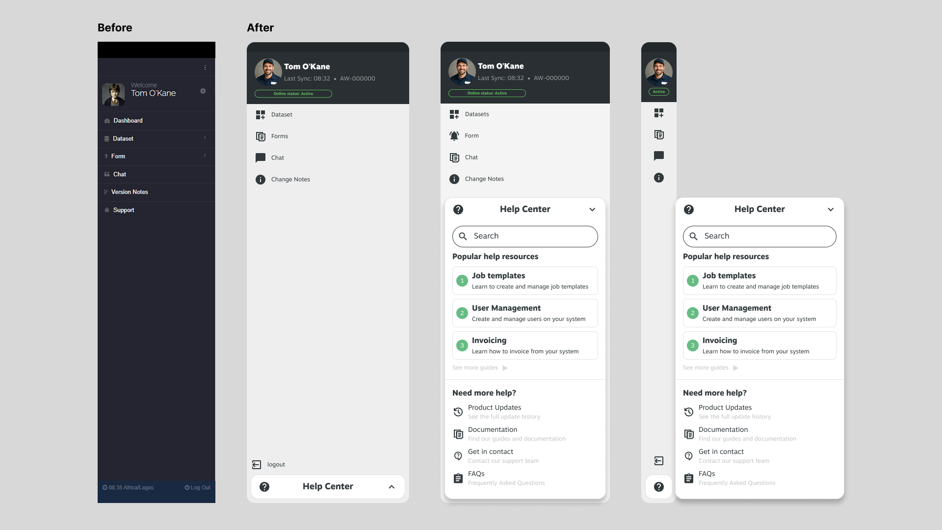
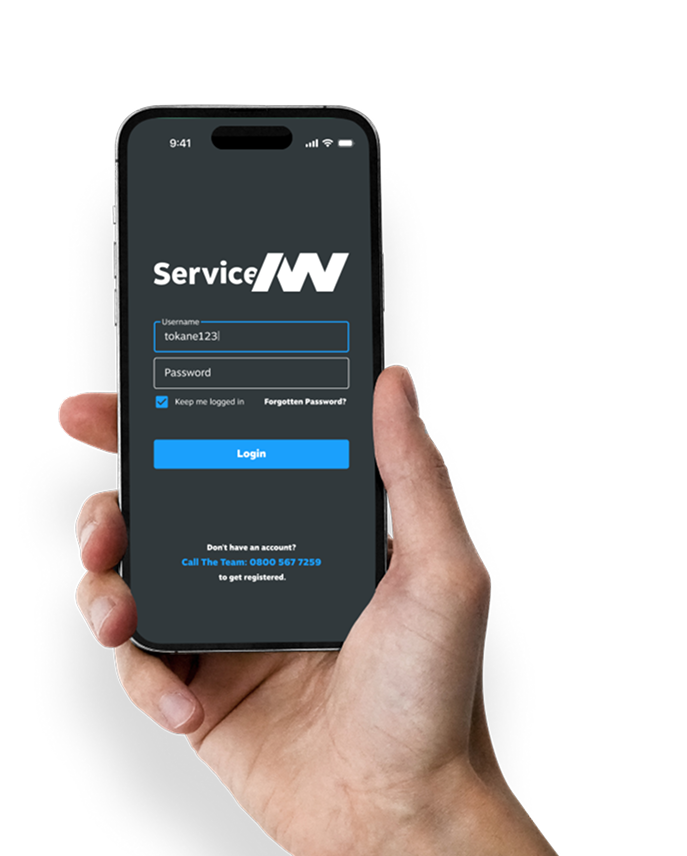
Poor usability and inconsistent UI
Problem
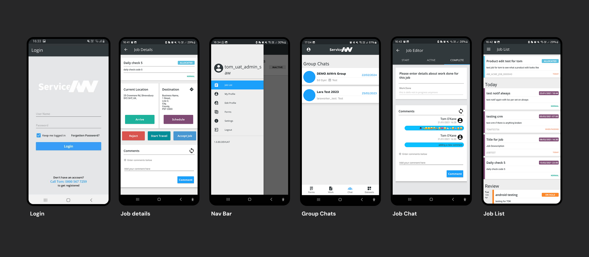
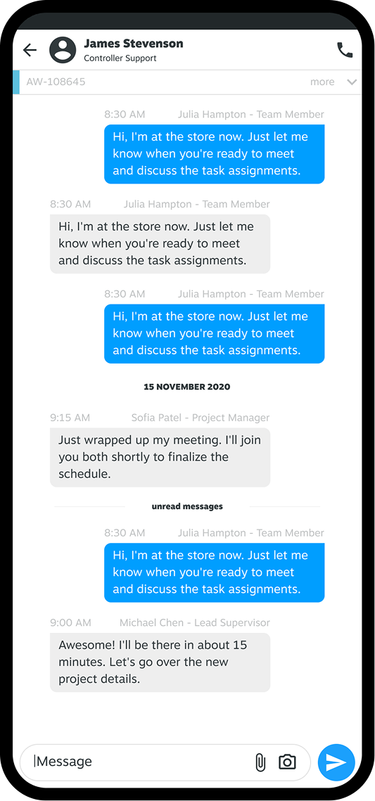
The job details page was cluttered and inconsistent, making it difficult for users to quickly locate essential information. Critical actions, such as status updates, notes, and assignments, were buried, which slowed down workflows.
Why it mattered
This screen was central to ServiceAtWrk, as every engineer and dispatcher used it daily. Its inefficiency made the entire product seem sluggish and unrefined.
Approach
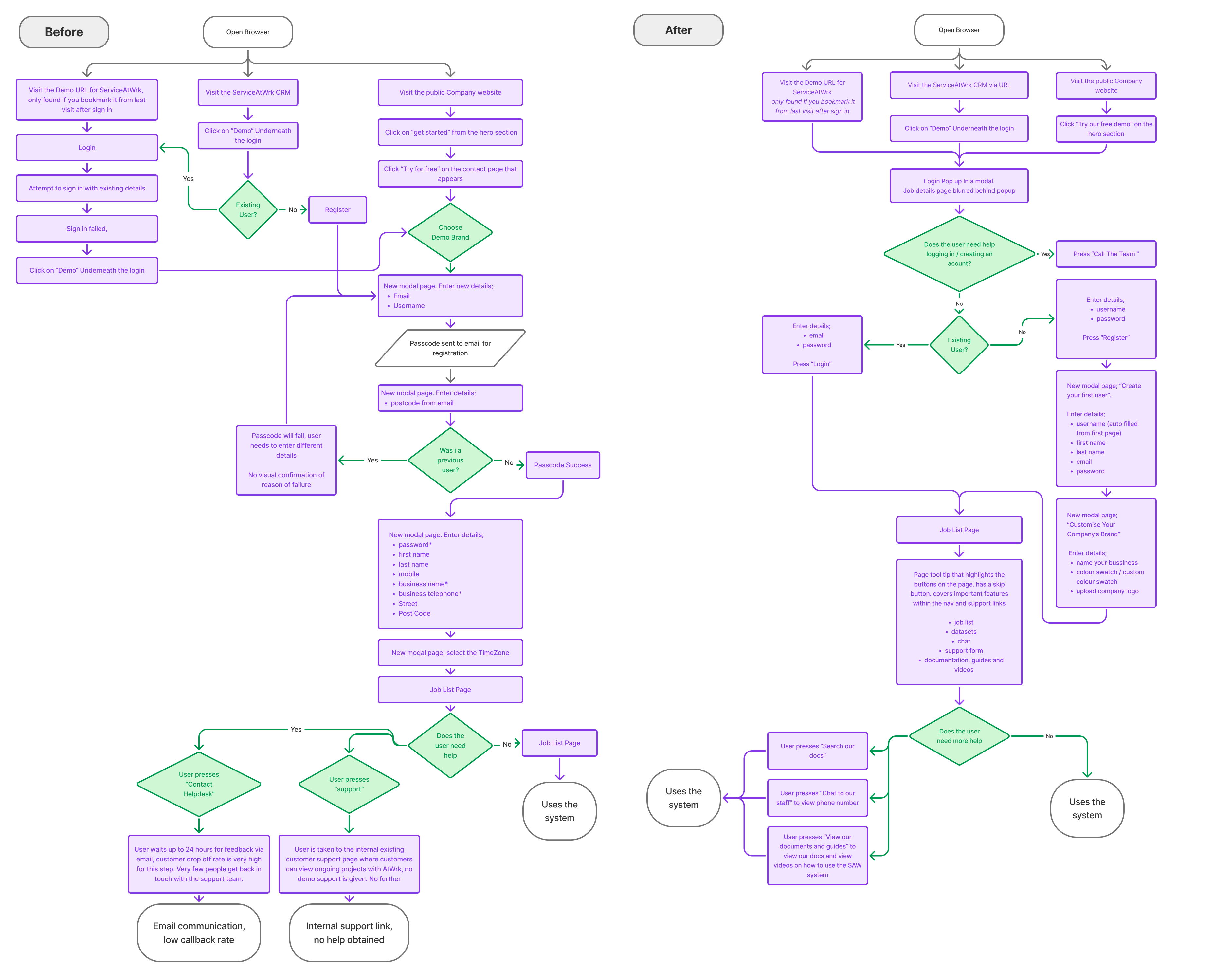
I performed a comprehensive feature audit and engaged with internal users to determine the primary actions used daily and those that were secondary. I then organized a clearer hierarchy, categorizing information into logical sections.
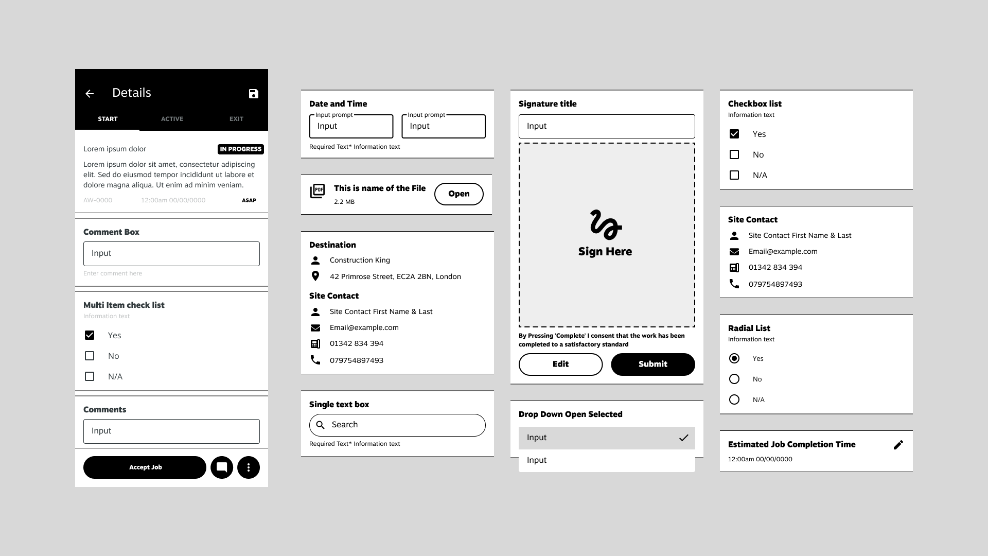
Initial concepts
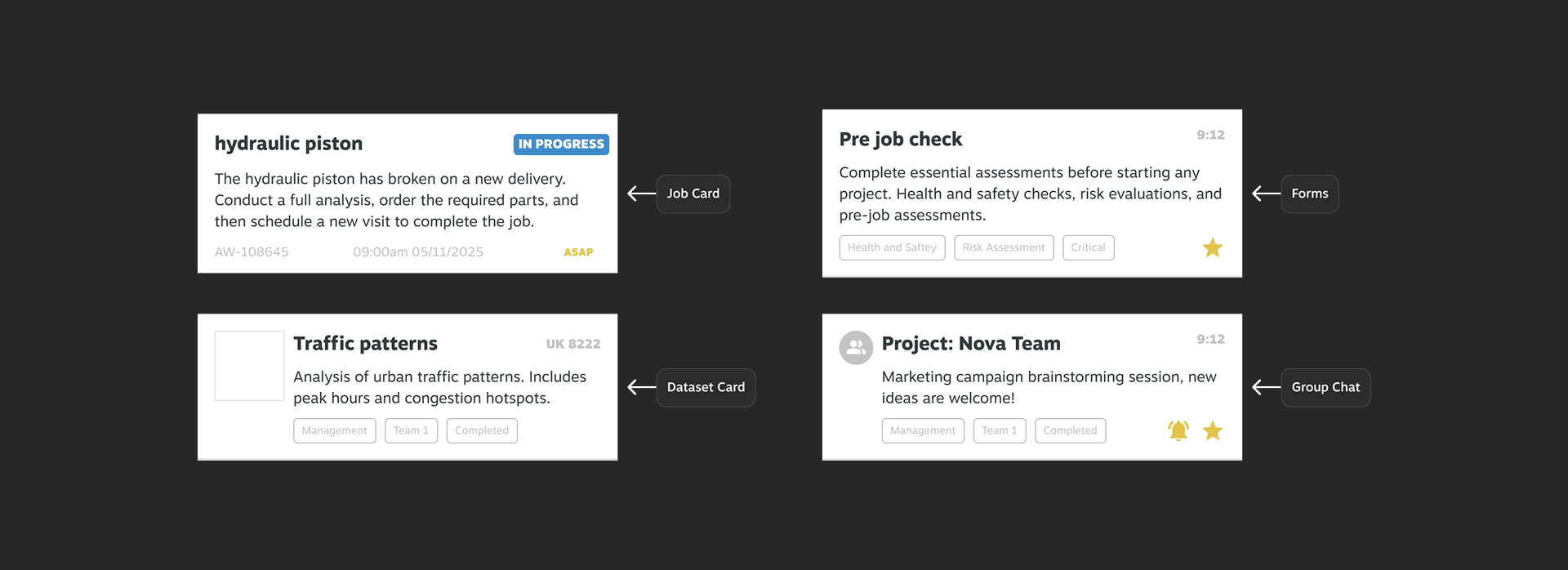
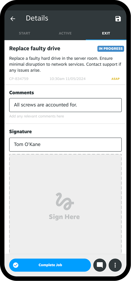
A streamlined job details page that highlights the most crucial information immediately, with expandable sections for additional details. Status updates and communication were relocated to a fixed, easily accessible area.
Concepts
Wireframing
Initial experiments had spacers between form elements, mimicking the floating card design from the original design. However this added unwanted visual clutter to what was already visually complex floating card design. The stake holders also agreed
I tried implementing a progress bar to help users navigate the Start, Active, and Exit tabs. However, developers strongly opposed this because our dynamic job templates would necessitate a GUI option to support them.
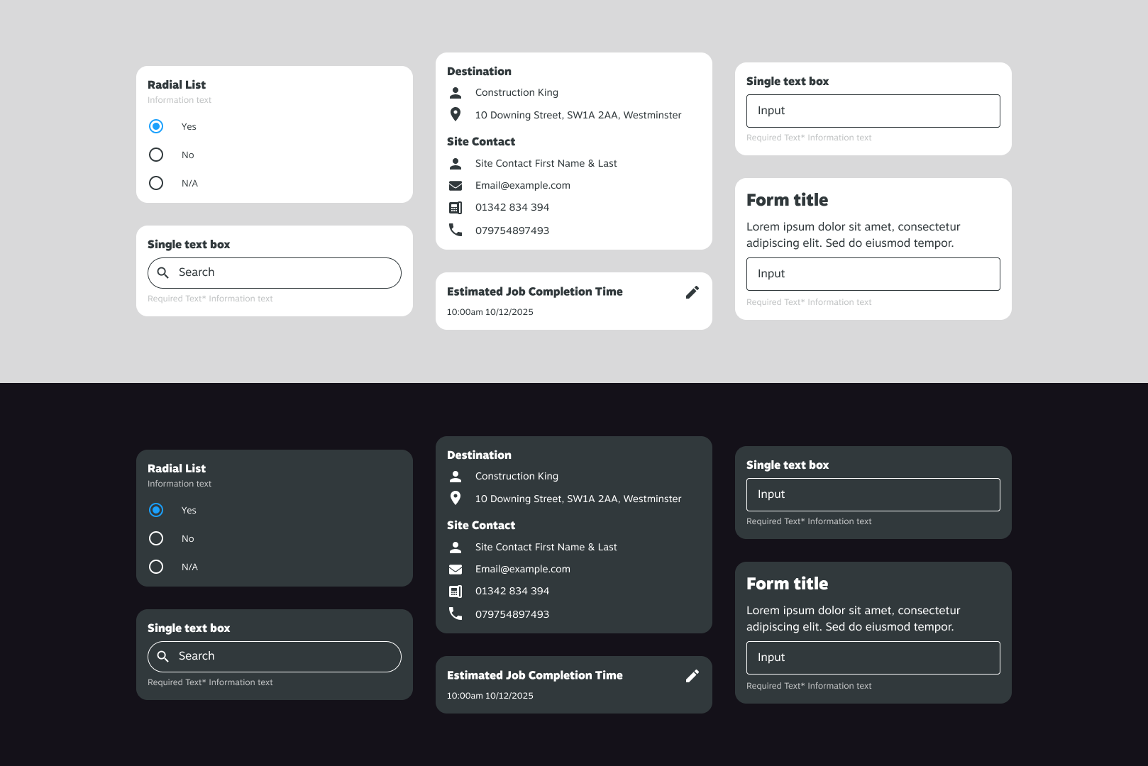
High Fidelity
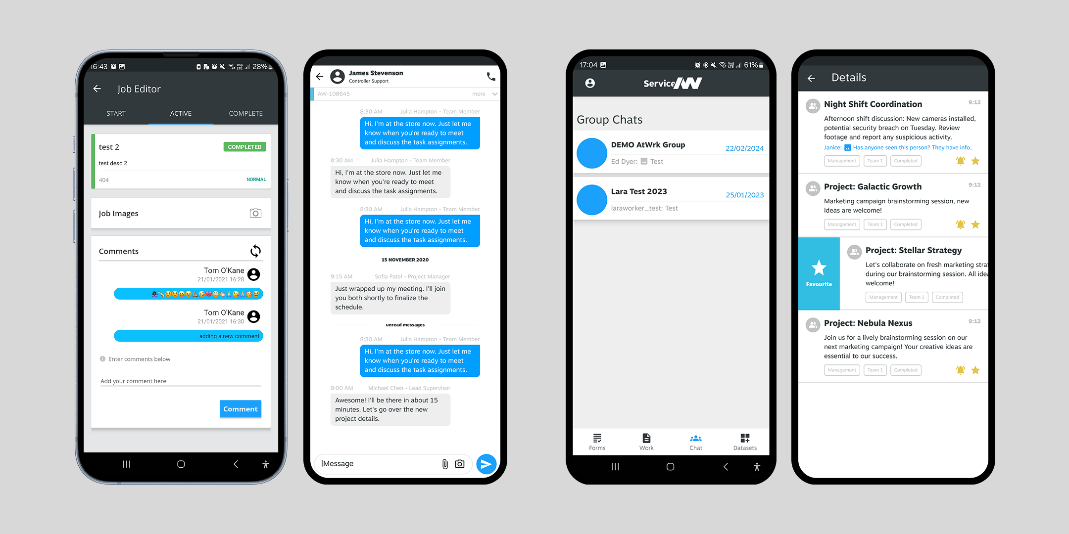
A streamlined job details page that highlights key information upfront, with expandable sections for additional details. Status updates and communication are now in a fixed, easily accessible spot.
Solution:

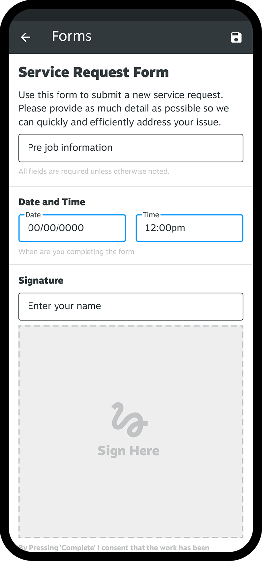
Discontinued using floating cards for forms as they proved ineffective for endless scrolling
Tabbed view recieved UI update and terminilogy improvments
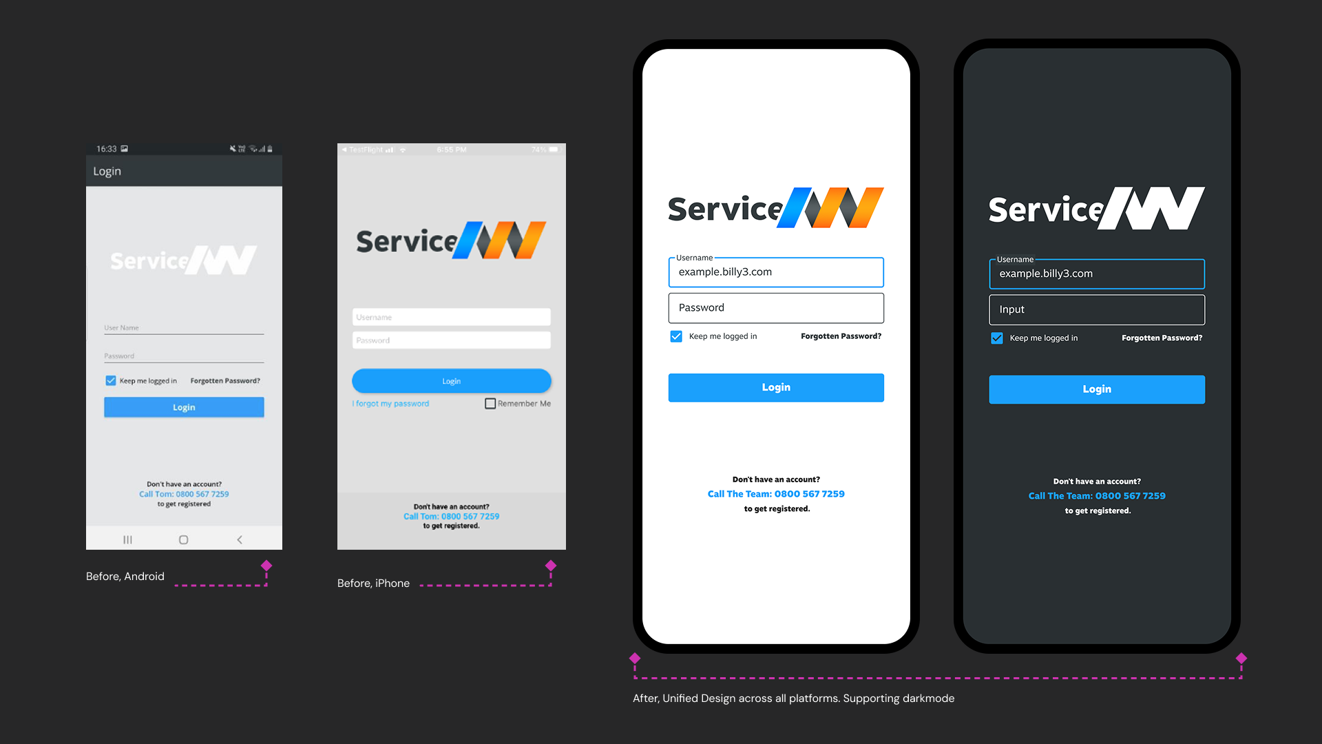
Uniform expirience across IOS and Android. Updated text boxes and text spacing to M3 standards with accessibility considered
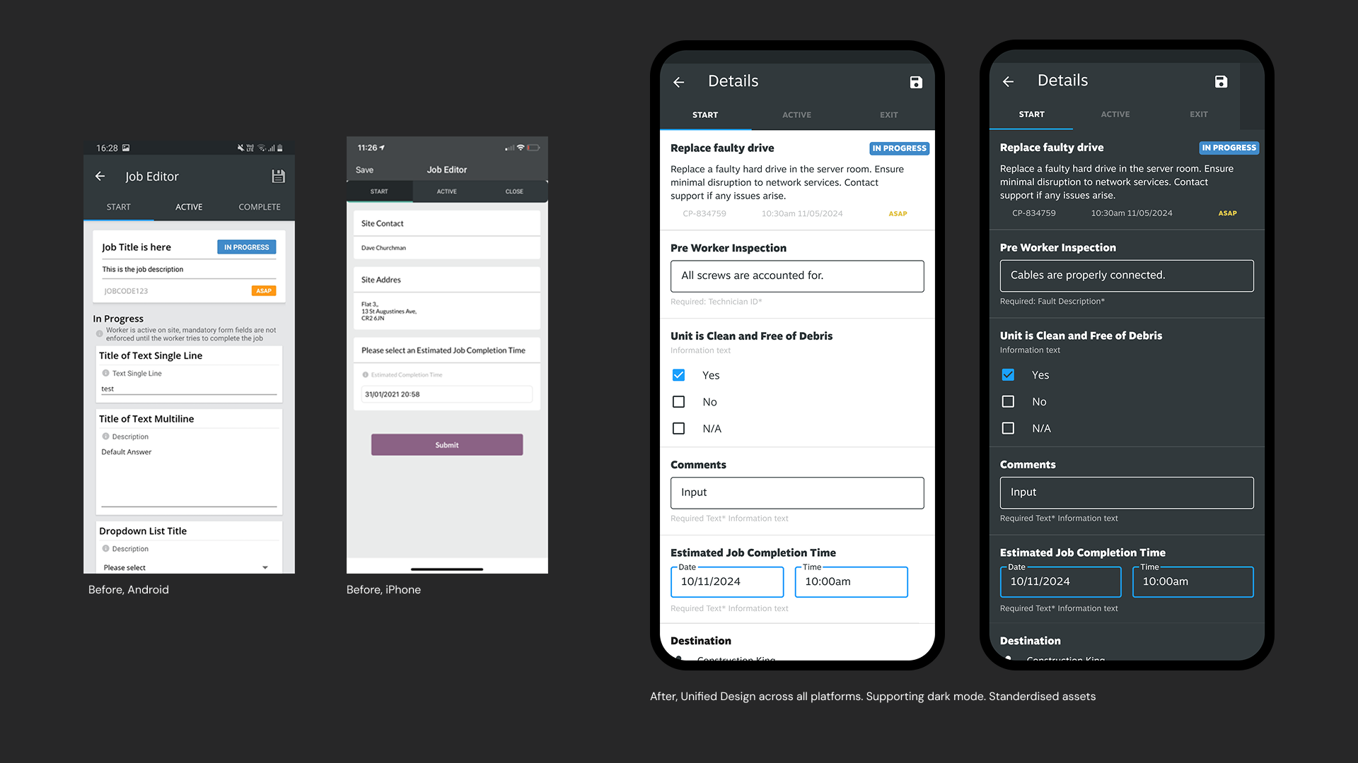
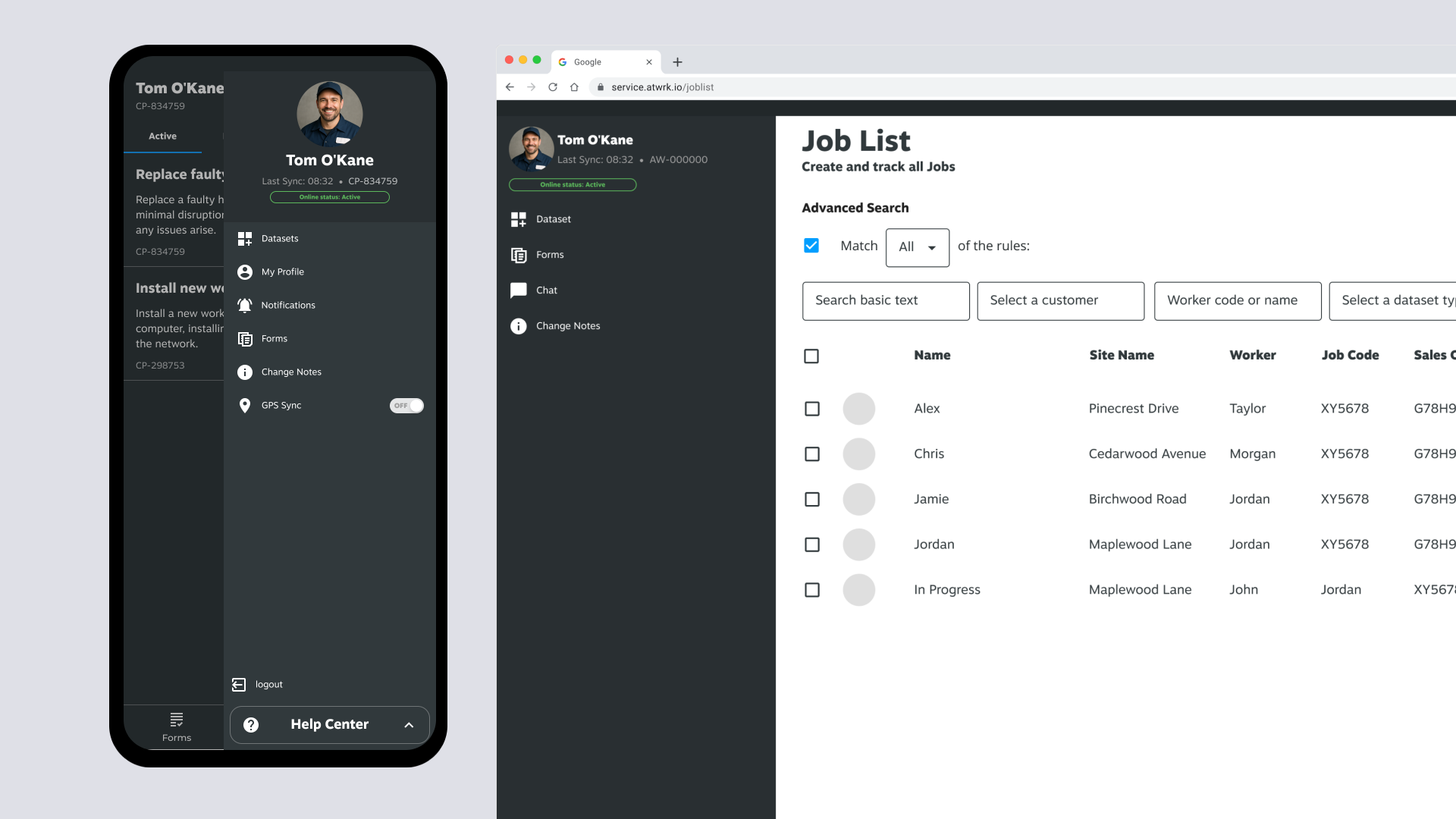
The Start, Active, and Exit tabs guide users through the necessary data at each job stage. This approach divides job requirements into manageable pages, providing relevant information to assist users effectively. For instance, a user in the Exit stage would benefit more from a 'sign off' section than a 'pre-worker inspection' card.

